gridLayout
Компонент gridLayout располагает дочерние компоненты в адаптивной, двумерной системе сетки, основанной на CSS Grid Layout.
XML-элемент |
|
|---|---|
Java-класс |
|
Атрибуты |
id - alignSelf - classNames - columnMinWidth - css - enabled - gap - height - itemsContainer - itemsEnum - justifySelf - maxHeight - maxWidth - minHeight - minWidth - visible - width |
Обработчики |
|
Элементы |
Основы
Вы можете заполнить gridLayout компонентами либо декларативно в XML-дескрипторе, либо программно в контроллере с помощью метода gridLayout.add().
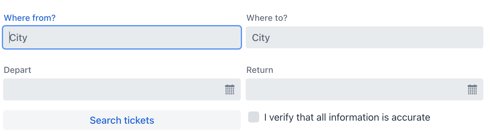
Пример декларативного добавления:
<gridLayout id="gridLayout" width="100%">
    <textField placeholder="City" label="Where from?"/>
    <textField placeholder="City" label="Where to?"/>
    <datePicker label="Depart"/>
    <datePicker label="Return"/>
    <button text="Search tickets" height="AUTO"/>
</gridLayout>
Пример добавления в контроллере экрана:
@ViewComponent
private GridLayout<Object> gridLayout;

@Autowired
private UiComponents uiComponents;

@Subscribe
public void onInit(final InitEvent event) {
    Checkbox checkbox = uiComponents.create(Checkbox.class);
    checkbox.setLabel("I verify that all information is accurate");
    checkbox.setValue(false);
    gridLayout.add(checkbox);
}
Привязка данных
Привязка данных означает связывание визуального компонента с контейнером данных.
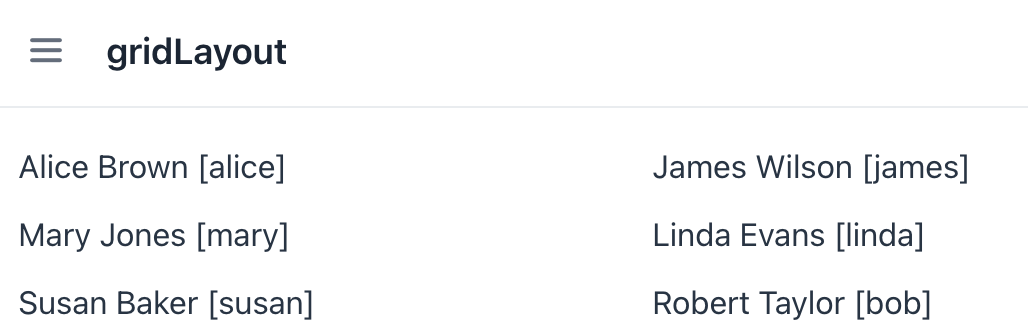
В компоненте gridLayout это достигается путем установки атрибута itemsContainer, который ссылается на контейнер данных.
<data>
    <collection id="usersDc" class="com.company.onboarding.entity.User"> (1)
        <fetchPlan extends="_base">
            <property name="department" fetchPlan="_base"/>
        </fetchPlan>
        <loader id="usersDl" readOnly="true">
            <query>
                <![CDATA[select e from User e]]>
            </query>
        </loader>
    </collection>
</data>
<facets>
    <dataLoadCoordinator auto="true"/> (2)
</facets>
<layout>
    <gridLayout width="100%"
                itemsContainer="usersDc"/> (3)
</layout>| 1 | Контейнер данных для хранения коллекции всех существующих экземпляров User. |
| 2 | Координатор загрузки данных для автоматического предоставления компоненту экземпляров для отображения. |
| 3 | Указание контейнера, который содержит список элементов для отображения. |
По умолчанию компонент отображает имя экземпляра сущности.
| Вы можете переопределить отображение по умолчанию, настроив пользовательский рендерер. |
Компонент также поддерживает отображение значений перечислений с помощью свойства itemsEnum.
<gridLayout itemsEnum="com.company.onboarding.entity.DayOfWeek"
            width="100%"/>
Рендеринг элементов
Существует возможность настройки рендеринга элементов. Рендерер применяется к каждому элементу для создания компонента, который его представляет.
Это можно выполнить двумя различными методами.
Программный подход
В контроллере экрана используйте либо:
-
Метод
setRenderer(); -
Аннотацию
@Supply.
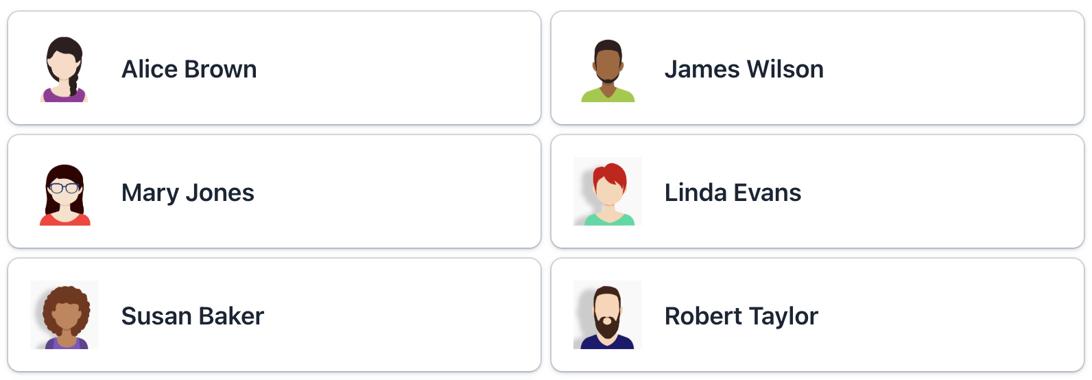
Основываясь на предыдущем примере, мы можем создать renderer для отображения каждого пользователя в виде пользовательского компонента Card.
Показать код
@Supply(to = "gridLtUsers", subject = "renderer")
private ComponentRenderer<Card, User> gridLtUsersRenderer() { (1)
    return new ComponentRenderer<>(this::createCard, this::initCard);
}

private Card createCard() { (2)
    Card card = uiComponents.create(Card.class);
    card.setWidthFull();
    card.addThemeVariants(CardVariant.LUMO_OUTLINED, CardVariant.LUMO_ELEVATED);
    return card;
}

private void initCard(Card card, User user) { (3)
    card.setHeaderPrefix(createAvatar(user));
    card.setTitle(user.getFirstName() + " " + user.getLastName());
    card.setSubtitle(createSubtitle(user));
    card.setHeaderSuffix(createHeaderSuffix(user));
}

private Image createAvatar(User user) { (4)
    Image image = uiComponents.create(Image.class);
    FileRef fileRef = user.getPicture();
    if (fileRef != null) {
        image.setWidth("50px");
        image.setHeight("50px");
        InputStreamDownloadHandler handler = DownloadHandler.fromInputStream(event -> {
            InputStream inputStream = fileStorageLocator.getByName(fileRef.getStorageName()).openStream(fileRef);
            return new DownloadResponse(inputStream, fileRef.getFileName(), fileRef.getContentType(), -1);
        });
        image.setSrc(handler);
    }
    return image;
}

private Span createSubtitle(User user) {
    Span span = uiComponents.create(Span.class);
    span.setText("%s: %s".formatted(
            getPropertyCaption(user, "department"),
            (user.getDepartment() != null ?
                    user.getDepartment().getName() :
                    "Not assigned")));
    return span;
}

private String getPropertyCaption(User user, String property) {
    MetaClass metaClass = metadata.getClass(user);
    return messageTools.getPropertyCaption(metaClass, property);
}

private Span createHeaderSuffix(User user) {
    Span span = uiComponents.create(Span.class);
    if (user.getActive()) {
        span.setText("Active");
        span.getElement().getThemeList().add("badge success");
    }
    else {
        span.setText("Inactive");
        span.getElement().getThemeList().add("badge error");
    }
    return span;
}| 1 | Предоставляет пользовательский рендерер для отображения каждого User в виде карточки. |
| 2 | Создает базовый компонент Card с общим стилем. |
| 3 | Инициализирует содержимое карточки данными конкретного пользователя. Вызывается для каждого экземпляра карточки с соответствующей сущностью User. |
| 4 | Создает компонент image из изображения пользователя. |
Декларативный подход
Альтернативно, вы можете отображать элементы, используя вложенный элемент fragmentRenderer.
-
Создайте XML-дескриптор
FragmentRenderer:<?xml version="1.0" encoding="UTF-8" standalone="no"?> <fragment xmlns="http://jmix.io/schema/flowui/fragment"> <data> <instance id="userDc" class="com.company.onboarding.entity.User"> <loader id="userDl"/> <fetchPlan extends="_base"/> </instance> </data> <content> <vbox id="root" padding="false"/> </content> </fragment> -
Создайте Java-контроллер
FragmentRendererКласс фрагментного рендерера должен расширять базовый класс
FragmentRendererс параметрами типа, указывающими на корневой компонент и отображаемую сущность, например:Показать код
@FragmentDescriptor("card-fragment.xml") @RendererItemContainer("userDc") public class CardFragment extends FragmentRenderer<VerticalLayout, User> { @Autowired private FileStorageLocator fileStorageLocator; @Autowired private Metadata metadata; @Autowired private MessageTools messageTools; @Override protected void onAttach(AttachEvent attachEvent) { super.onAttach(attachEvent); initLayout(); } private void initLayout() { Card card = uiComponents.create(Card.class); card.setWidthFull(); card.addThemeVariants(CardVariant.LUMO_OUTLINED, CardVariant.LUMO_ELEVATED); card.setHeaderPrefix(createAvatar(getItem())); card.setTitle(getItem().getFirstName() + " " + getItem().getLastName()); card.setSubtitle(createSubtitle(getItem())); card.setHeaderSuffix(createHeaderSuffix(getItem())); getContent().add(card); } private Image createAvatar(User user) { Image image = uiComponents.create(Image.class); FileRef fileRef = user.getPicture(); if (fileRef != null) { image.setWidth("50px"); image.setHeight("50px"); InputStreamDownloadHandler handler = DownloadHandler.fromInputStream(event -> { InputStream inputStream = fileStorageLocator.getByName(fileRef.getStorageName()).openStream(fileRef); return new DownloadResponse(inputStream, fileRef.getFileName(), fileRef.getContentType(), -1); }); image.setSrc(handler); } return image; } private Span createSubtitle(User user) { Span span = uiComponents.create(Span.class); span.setText("%s: %s".formatted( getPropertyCaption(user, "department"), (user.getDepartment() != null ? user.getDepartment().getName() : "Not assigned"))); return span; } private String getPropertyCaption(User user, String property) { MetaClass metaClass = metadata.getClass(user); return messageTools.getPropertyCaption(metaClass, property); } private Span createHeaderSuffix(User user) { Span span = uiComponents.create(Span.class); if (user.getActive()) { span.setText("Active"); span.getElement().getThemeList().add("badge success"); } else { span.setText("Inactive"); span.getElement().getThemeList().add("badge error"); } return span; } } -
Используйте
fragmentRendererдля компонентаgridLayout:<gridLayout id="gridUsers" width="100%" itemsContainer="usersDc" gap="var(--lumo-space-m)"> <fragmentRenderer class="com.company.onboarding.view.layout.gridlayout.CardFragment"/> </gridLayout>
Атрибуты
Общие атрибуты служат одной и той же цели для всех компонентов.
Следующие атрибуты специфичны для gridLayout:
Название |
Описание |
Значение по умолчанию |
|---|---|---|
Управляет вертикальным выравниванием компонента внутри ячейки Доступно для проектов с версии 2.7.2 и выше. |
|
|
Задает минимальную ширину для столбцов сетки в |
|
|
Управляет промежутком между ячейками сетки (как между строками, так и между столбцами). Создает визуальное разделение между компонентами. Значение представляется в виде CSS-значения длины (например, |
|
|
Управляет горизонтальным выравниванием компонента внутри ячейки Доступно для проектов с версии 2.7.2 и выше. |
|
Обработчики
Общие обработчики настраиваются одинаково для всех компонентов.
Следующие обработчики специфичны для gridLayout.
|
Чтобы сгенерировать заглушку обработчика в Jmix Studio, используйте вкладку Handlers панели инспектора Jmix UI, или команду Generate Handler, доступную на верхней панели контроллера экрана и через меню Code → Generate (Alt+Insert / Cmd+N). |
Название |
Описание |
|---|---|
Позволяет настроить надписи, отображаемые для каждого элемента. Смотрите Настройка отображения элементов. |
|
Устанавливает рендерер элементов для |