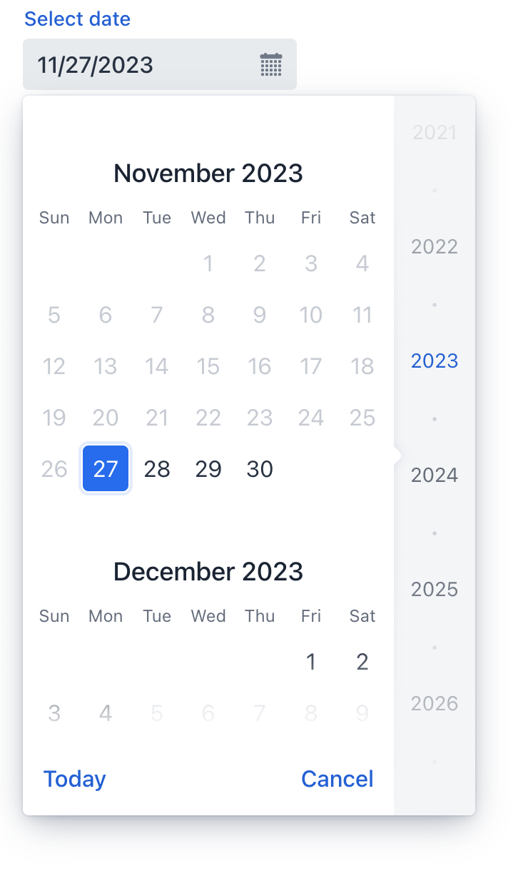
datePicker
datePicker lets users enter a date by typing or select it using a calendar overlay.
-
XML element:
datePicker -
Java class:
TypedDatePicker
Basics
Unlike a regular input field, datePicker has a calendar button and a calendar overlay. The calendar opens when the user clicks the button or the field itself, or starts entering a date.

The calendar is scrollable and allows selecting a year in the right pane. Click Today at the bottom to navigate back to the current date.
The following example defines a datePicker with a label:
<datePicker id="datePicker" label="Select date"/>Data Types
datePicker is a typed component which supports common data types for storing a date:
-
date -
dateTime -
localDateTime -
offsetDateTime -
localDate
To change the type, use the datatype attribute.
Date Format
The default date and time format in the application is defined by the localized format strings. To use a different format, add your own format strings to the message bundle.
To change the format for a particular component, use its dateFormat attribute.
Date Range
To restrict the input to a specific date range, specify a minimum and maximum value using the max and min attributes. This can also be done in the view controller:
@ViewComponent
private TypedDatePicker<Comparable> datePicker;

@Subscribe
public void onInit(InitEvent event) {
    datePicker.setMin(LocalDate.now());
    datePicker.setMax(LocalDate.now().plusDays(7));
}
Validation
To check values entered into datePicker, you can use a validator in a nested validators element.
The following predefined validators are available for datePicker:
In the example below, we will show a FutureValidator usage:
<datePicker label="Select a future date"
            datatype="date">
    <validators>
        <future/>
    </validators>
</datePicker>
Attributes
id - alignSelf - allowedCharPattern - autoOpen - classNames - clearButtonVisible - colspan - dataContainer - datatype - dateFormat - enabled - errorMessage - height - helperText - invalid - label - max - maxHeight - maxWidth - min - minHeight - minWidth - name - opened - placeholder - property - readOnly - required - requiredIndicatorVisible - requiredMessage - step - tabIndex - themeNames - visible - weekNumbersVisible - width
Handlers
AttachEvent - BlurEvent - ClientValidatedEvent - ComponentValueChangeEvent - DetachEvent - FocusEvent - InvalidChangeEvent - OpenedChangeEvent - TypedValueChangeEvent - statusChangeHandler - validator
|
Чтобы сгенерировать заглушку обработчика в Jmix Studio, используйте вкладку Handlers панели инспектора Jmix UI, или команду Generate Handler, доступную на верхней панели контроллера экрана и через меню Code → Generate (Alt+Insert / Cmd+N). |
ClientValidatedEvent
ClientValidatedEvent is sent by the web component whenever it is validated on the client-side.
InvalidChangeEvent
com.vaadin.flow.component.datepicker.DatePicker.InvalidChangeEvent is sent when the value of the invalid attribute of the component changes.
OpenedChangeEvent
OpenedChangeEvent is sent every time the opened attribute of the component changes. That is, when the calendar is opened or closed.
validator
Adds a validator instance to the component. The validator must throw ValidationException if the value is not valid. For example:
@Install(to = "birthDatePicker", subject = "validator")
private void birthDatePickerValidator(Date date) {
        Date now = timeSource.currentTimestamp();
        if (date != null && DateUtils.addYears(now,-18).compareTo(date) < 0) {
            throw new ValidationException("The age must be over 18 years");
        }
}See Also
See Vaadin Docs for more information.