datePicker
datePicker позволяет пользователям вводить дату с клавиатуры или выбирать ее с помощью всплывающего календаря.
-
XML-элемент:
datePicker -
Java-класс:
TypedDatePicker
Основы
В отличие от обычного поля ввода, datePicker имеет кнопку календаря и всплывающий календарь. Календарь открывается, когда пользователь нажимает на кнопку или на само поле, либо начинает вводить дату.
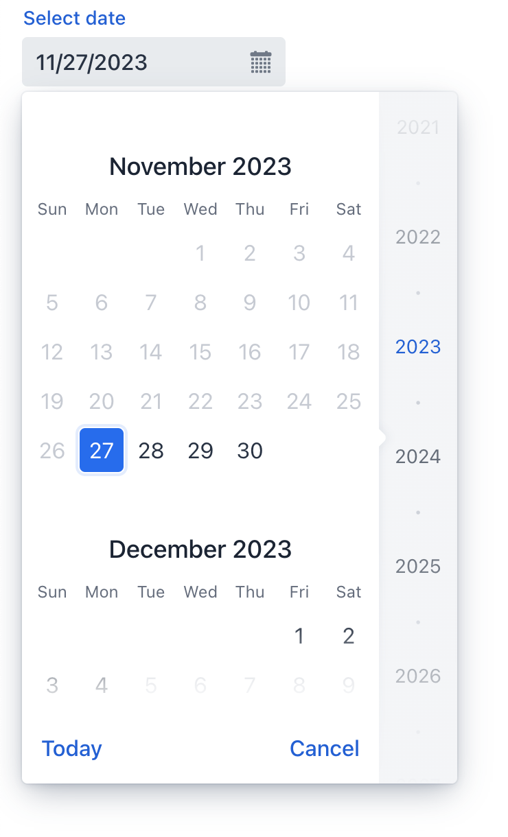
Календарь можно прокручивать, и он позволяет выбирать год в правой панели. Нажмите Today внизу, чтобы вернуться к текущей дате.
В следующем примере определяется datePicker с меткой:
<datePicker label="Select date"/>Типы данных
datePicker - это типизированный компонент, который поддерживает распространенные типы данных для хранения даты:
-
date -
dateTime -
localDateTime -
offsetDateTime -
localDate
Когда вы связываете компонент с атрибутом сущности, он автоматически принимает тип данных этого атрибута. Чтобы установить тип явно, используйте атрибут datatype.
Привязка данных
Привязка данных (data binding) относится к связыванию визуального компонента с контейнером данных. Изменения в визуальном компоненте или соответствующем контейнере данных могут вызывать обновления друг друга. Смотрите Использование компонентов данных для получения более подробной информации.
В следующем примере создается компонент datePicker, работающий с данными:
<datePicker dataContainer="userStepDc" property="dueDate"/>Формат даты
Формат даты и времени по умолчанию в приложении определяется локализованными строками формата. Чтобы использовать другой формат, добавьте собственные строки формата в пакет сообщений.
Чтобы изменить формат для конкретного компонента, используйте его атрибут dateFormat.
Диапазон дат
Чтобы ограничить ввод конкретным диапазоном дат, укажите минимальную и максимальную даты, используя атрибуты max и min:
<datePicker id="datePicker" min="2024-01-01" max="2024-12-31"/>Или укажите адаптируемый диапазон дат внутри контроллера экрана:
@ViewComponent
private TypedDatePicker<Comparable> datePicker;

@Subscribe
public void onInit(InitEvent event) {
    datePicker.setMin(LocalDate.now());
    datePicker.setMax(LocalDate.now().plusDays(7));
}
Варианты темы
Используйте атрибут themeNames для настройки темы компонента.
| Вариант | Описание | Поддерживается в |
|---|---|---|
|
Уменьшает размер компонента. |
Aura, Lumo |
|
Выравнивает значение поля по левому краю. |
Aura, Lumo |
|
Выравнивает значение поля по центру. |
Aura, Lumo |
|
Выравнивает значение поля по правому краю. |
Aura, Lumo |
|
Размещает вспомогательный текст над полем, под меткой. |
Aura, Lumo |
Валидация
Чтобы проверить значения, введенные в datePicker, добавьте элемент validator. Это позволяет добавить пользовательский критерий проверки или выбрать один из следующих предопределенных валидаторов:
Этот пример демонстрирует, как использовать FutureValidator, чтобы убедиться, что выбранная дата находится в будущем:
<datePicker label="Select a future date"
            datatype="date">
    <validators>
        <future/>
    </validators>
</datePicker>
Атрибуты
id - alignSelf - allowedCharPattern - ariaLabel - ariaLabelledBy - autoOpen - classNames - clearButtonVisible - colspan - css - dataContainer - datatype - dateFormat - enabled - errorMessage - focusShortcut - height - helperText - label - max - maxHeight - maxWidth - min - minHeight - minWidth - name - opened - overlayClass - placeholder - property - readOnly - required - requiredMessage - tabIndex - themeNames - visible - weekNumbersVisible - width
autoOpen
Определяет, открывается ли всплывающий календарь, когда пользователь начинает вводить дату.
-
Если установлено значение
true, всплывающий календарь открывается как при вводе данных пользователем, так и при нажатии на кнопку календаря или на поле. -
Если установлено значение
false, всплывающий календарь открывается только при нажатии на кнопку календаря.
Обработчики
AttachEvent - BlurEvent - ClientValidatedEvent - ComponentValueChangeEvent - DetachEvent - FocusEvent - InvalidChangeEvent - OpenedChangeEvent - TypedValueChangeEvent - statusChangeHandler - validator
|
Чтобы сгенерировать заглушку обработчика в Jmix Studio, используйте вкладку Handlers панели инспектора Jmix UI, или команду Generate Handler, доступную на верхней панели контроллера экрана и через меню Code → Generate (Alt+Insert / Cmd+N). |
ClientValidatedEvent
ClientValidatedEvent отправляется веб-компонентом всякий раз, когда он проходит валидацию на стороне клиента.
InvalidChangeEvent
com.vaadin.flow.component.datepicker.DatePicker.InvalidChangeEvent отправляется при изменении значения атрибута invalid компонента.
OpenedChangeEvent
OpenedChangeEvent отправляется каждый раз, когда изменяется атрибут opened компонента. То есть, когда календарь открывается или закрывается.
validator
Добавляет экземпляр валидатора к компоненту. Валидатор должен выбрасывать исключение ValidationException, если значение недействительно. Например:
@Install(to = "birthDatePicker", subject = "validator")
private void birthDatePickerValidator(Date date) {
        Date now = timeSource.currentTimestamp();
        if (date != null && DateUtils.addYears(now,-18).compareTo(date) < 0) {
            throw new ValidationException("The age must be over 18 years");
        }
}Смотрите также
Смотрите документацию Vaadin для получения дополнительной информации.