tabSheet
Контейнер, который создает несколько вкладок с содержимым. Одновременно видно только содержимое выбранной вкладки.
XML-элемент |
|
|---|---|
Java-класс |
|
Атрибуты |
id - alignSelf - classNames - colspan - css - height - maxHeight - maxWidth - minHeight - minWidth - themeNames - visible - width |
Обработчики |
|
Элементы |
Основы
Для создания компонента используйте XML-элемент tabSheet и добавьте несколько элементов tab. Каждый tab может иметь только один дочерний компонент. Если необходимо разместить несколько компонентов внутри вкладки, нужно обернуть их контейнером, таким как vbox.
Следующий пример демонстрирует создание базового tabSheet:
<tabSheet>
    <tab id="tab1" label="Tab One">
        <vbox>
            <label text="Label One"/>
            <textField placeholder="Text Field One"/>
        </vbox>
    </tab>
    <tab id="tab2" label="Tab Two">
        <label text="Label Two"/>
    </tab>
    <tab id="tab3" label="Tab Three">
        <label text="Label Three"/>
    </tab>
</tabSheet>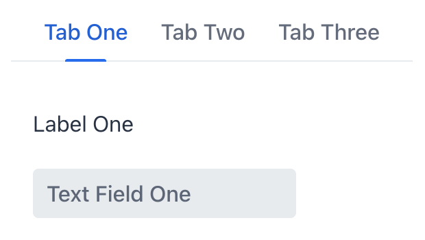
Элемент tab
Содержимое отдельной вкладки описывается элементом tab.
Чтобы добавить tab в Jmix Studio, выберите компонент в XML-дескрипторе экрана или на панели структуры Jmix UI и нажмите кнопку Add→Tab на панели Component Inspector.
|
XML-элемент |
|
|---|---|
Java-класс |
|
Атрибуты |
id - ariaLabel - ariaLabelledBy - classNames - colspan - css - enabled - flexGrow - label - lazy - themeNames - visible |
Обработчики |
|
Элементы |
Количество вкладок
Компонент tabSheet может иметь любое практическое количество вкладок. Для адаптации к доступному пространству компонент добавит кнопки прокрутки, обеспечивая доступность всех вкладок для пользователей.

Состояния
Состояние вкладки позволяет пользователям легко определить, какая вкладка активна в данный момент, а какие могут быть временно недоступны или отключены. Вкладка может быть выбрана, не выбрана или отключена.

Пользовательские надписи
Надписи вкладок не ограничиваются только текстом. Вы можете включать практически любые компоненты через программное определение.

Бейджи
Особенно полезным случаем является добавление динамических бейджей к надписям вкладок. Такие бейджи могут указывать на количество элементов, уведомлений или другую информацию, связанную с содержимым вкладки.

Обнаружение переключения вкладок
При каждом переключении пользователем между вкладками генерируется событие io.jmix.flowui.component.tabsheet.JmixTabSheet.SelectedChangeEvent. Создайте обработчик события для выполнения пользовательского кода в ответ на переключение вкладки.
Следующий код будет отправлять уведомление при каждом переключении вкладки:
@Subscribe("tabSheet")
public void onTabSheetSelectedChange(final JmixTabSheet.SelectedChangeEvent event) {
    notifications.create(event.getSelectedTab() + " is now selected").show();
}
Ленивые вкладки
Вкладка может быть настроена на ленивую загрузку своего содержимого, что означает, что содержимое загружается только когда пользователь выбирает эту конкретную вкладку. Это уменьшает количество компонентов в памяти.
Чтобы включить ленивую загрузку, установите атрибут lazy элемента tab в true:
<tabSheet id="tabSheet">
    <tab id="normalTab" label="Normal Tab">
        <vbox>
            <textField placeholder="textField"/>
            <button text="button"/>
        </vbox>
    </tab>
    <tab id="lazyTab" label="Lazy Tab" lazy="true">
        <vbox>
            <button text="button"/>
            <textField placeholder="textField"/>
        </vbox>
    </tab>
</tabSheet>
Компоненты внутри ленивой вкладки не существуют при открытии экрана, поэтому они не могут быть инжектированы в контроллер или получены в обработчиках событий жизненного цикла экрана. Вы можете получить доступ к этим компонентам только после того, как пользователь откроет вкладку. Обработчик SelectedChangeEvent позволяет определить, какая вкладка была выбрана, и получить доступ к компонентам с помощью метода UiComponentUtils.getComponent().
В следующем примере вторая вкладка настроена на ленивую загрузку, и ее содержимое загружается только при выборе пользователем. Текущее количество компонентов в каждой вкладке отображается с помощью дополнительного элемента span.
@ViewComponent
private Span contentInfo;
@ViewComponent
private JmixTabSheet tabSheet;
@Autowired
private Notifications notifications;

@Subscribe
public void onInit(final InitEvent event) {
    checkTabsContent();
}
@Subscribe("tabSheet")
public void onTabSheetSelectedChange(final JmixTabSheet.SelectedChangeEvent event) {
    checkTabsContent();
}

protected void checkTabsContent () {
    StringBuilder sb = new StringBuilder();
    List<Component> tab1Content = tabSheet.getContentByTab(tabSheet.getTabAt(0)).getChildren().toList();
    sb.append(tab1Content.isEmpty() ? "Empty" :  tab1Content.size() + " components");

    sb.append(" / ");
    List<Component> tab2Content = tabSheet.getContentByTab(tabSheet.getTabAt(1)).getChildren().toList();
    sb.append(tab2Content.isEmpty() ? "Empty" : tab2Content.size() + " components");

    contentInfo.setText(sb.toString());
}
Варианты темы
Используйте атрибут themeNames для настройки темы компонента.
| Вариант | Описание | Поддерживается в |
|---|---|---|
|
Для отдельного элемента |
Lumo |
|
Размещает вкладки по центру контейнера. |
Lumo |
|
Уменьшает размер вкладок. |
Aura, Lumo |
|
Упрощает визуальный стиль, оставляя акцент только на надписях. |
Lumo |
|
Скрывает кнопки прокрутки для навигации по не помещающимся вкладкам. |
Aura, Lumo |
|
Выделяет одинаковую ширину для всех вкладок и отключает прокрутку. |
Lumo |
|
Добавляет границу вокруг вкладок и области содержимого. |
Lumo |
|
Удаляет стандартные внутренние отступы из области содержимого. |
Aura, Lumo |
|
Удаляет границу вокруг |
Aura |
Смотрите также
Дополнительную информацию смотрите в документации Vaadin.