twinColumn
Компонент для интуитивного выбора элементов из списка или коллекции путем перемещения между двумя колонками.
-
XML-элемент:
twinColumn -
Java-класс:
TwinColumn
Основы
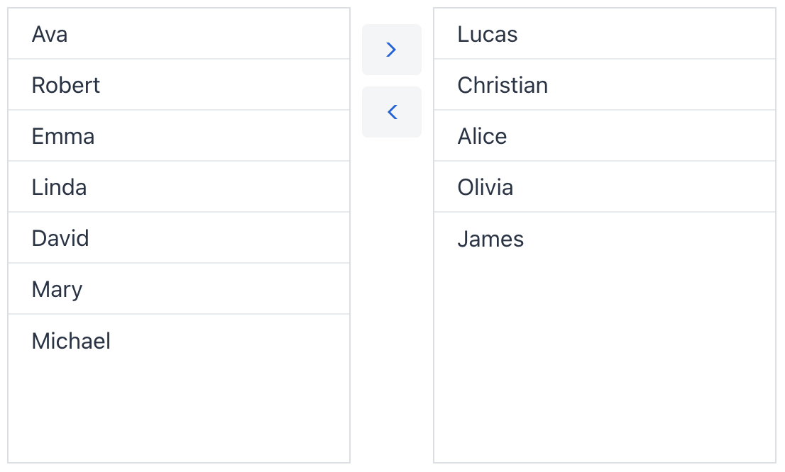
Компонент отображает две колонки бок о бок. Левая колонка содержит элементы для выбора, правая - уже выбранные элементы. Пользователи могут выбирать один или несколько элементов и перемещать их между колонками с помощью кнопок, добавляя или удаляя из выбора.
Для создания компонента используйте XML-элемент twinColumn и задайте его атрибут itemsContainer, указав контейнер коллекции. Элементы из этого контейнера будут отображаться в колонках.
Пример создания базового компонента twinColumn:
<data>
    <collection id="usersDc" class="com.company.onboarding.entity.User">
        <loader id="usersDl" readOnly="true">
            <query>
                <![CDATA[select e from User e]]>
            </query>
        </loader>
        <fetchPlan extends="_base"/>
    </collection>
</data>
<facets>
    <dataLoadCoordinator auto="true"/> (1)
</facets>
<layout>
    <twinColumn itemsContainer="usersDc"/>
</layout>| 1 | Включите dataLoadCoordinator фасет для автоматической загрузки данных. |
Привязка данных
Привязка данных означает связывание визуального компонента с контейнером данных. Изменения в компоненте или соответствующем контейнере могут вызывать взаимные обновления. Подробнее смотрите в разделе Использование компонентов данных.
Для создания twinColumn с привязкой к данным используйте атрибуты dataContainer и property. Атрибут itemsContainer используется для создания списка элементов.
Множественный выбор
Компонент twinColumn всегда работает в режиме множественного выбора, позволяя пользователям выбирать и перемещать несколько элементов одновременно. Вы также можете добавить возможность перемещения всех элементов сразу, установив атрибут selectAllButtonsVisible:
<twinColumn itemsContainer="usersDc" selectAllButtonsVisible="true"/>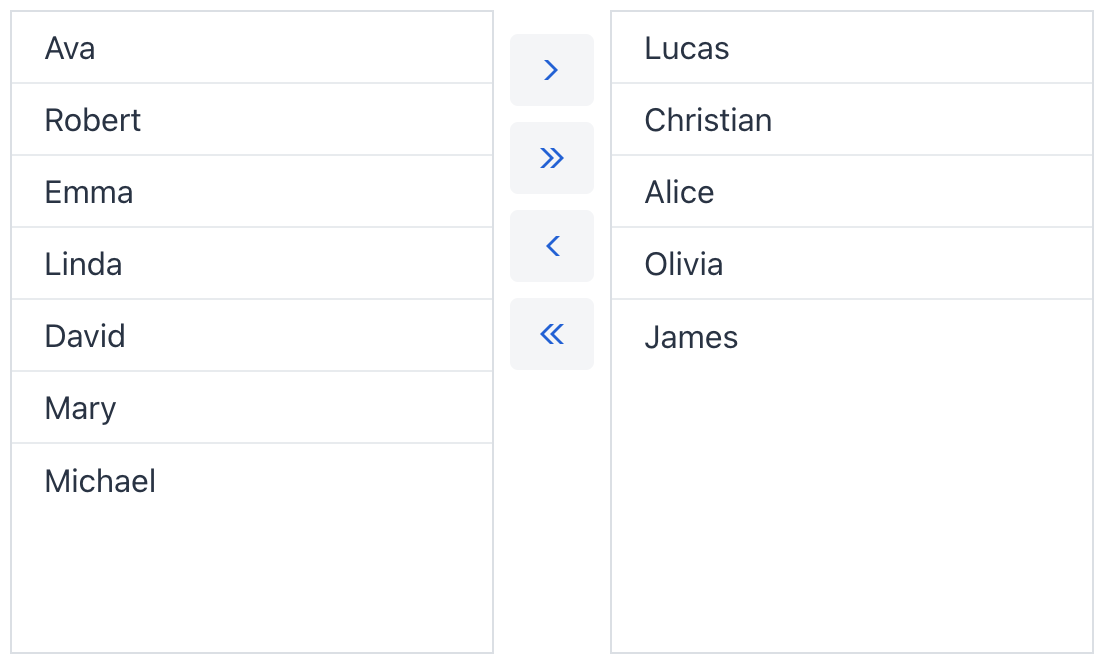
Надписи колонок
Вы можете задать описательные надписи для каждой колонки с помощью атрибутов itemsColumnLabel и selectedItemsColumnLabel:
<twinColumn itemsContainer="usersDc"
            itemsColumnLabel="Users"
            selectedItemsColumnLabel="Moderators"/>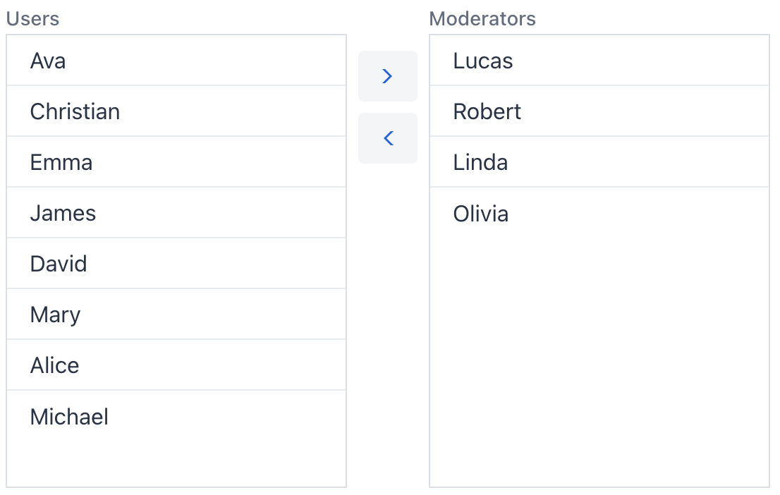
Порядок элементов
По умолчанию элементы не сохраняют свою исходную позицию в списке. При каждом перемещении в другую колонку элемент добавляется в конец списка. Вы можете сохранять исходный порядок элементов, установив reorderable="true".
<twinColumn itemsContainer="usersDc" reorderable="true"/>Варианты темы
Используйте атрибут themeNames для настройки темы компонента.
| Вариант | Описание | Поддерживается в |
|---|---|---|
|
Удаляет внешнюю границу компонента. |
Aura, Lumo |
|
Удаляет разделители между строками. |
Lumo |
|
Использует галочки для обозначения выбранных элементов вместо изменения цвета фона строки. |
Lumo |
|
Удаляет промежутки между кнопками действий. |
Aura, Lumo |
| Вы можете комбинировать несколько тем, перечисляя их через пробел, чтобы изменить несколько аспектов внешнего вида одновременно. |
Атрибуты
id - alignSelf - ariaLabel - ariaLabelledBy - classNames - colspan - css - dataContainer - enabled - height - helperText - itemsColumnLabel - itemsContainer - label - maxHeight - maxWidth - minHeight - minWidth - property - readOnly - reorderable - required - requiredMessage - selectAllButtonsVisible - selectedItemsColumnLabel - themeNames - visible - width