dateTimePicker
dateTimePicker - поле ввода для выбора как даты, так и времени суток. Чтобы выбрать либо дату, либо время, используйте datePicker или timePicker, соответственно.
-
XML-элемент:
dateTimePicker -
Java-класс:
TypedDateTimePicker
Основы
Дата и время могут быть введены непосредственно с клавиатуры или выбраны из соответствующей всплывающей панели. Всплывающая панель открывается при нажатии на соответствующее поле или при вводе каких-либо данных.
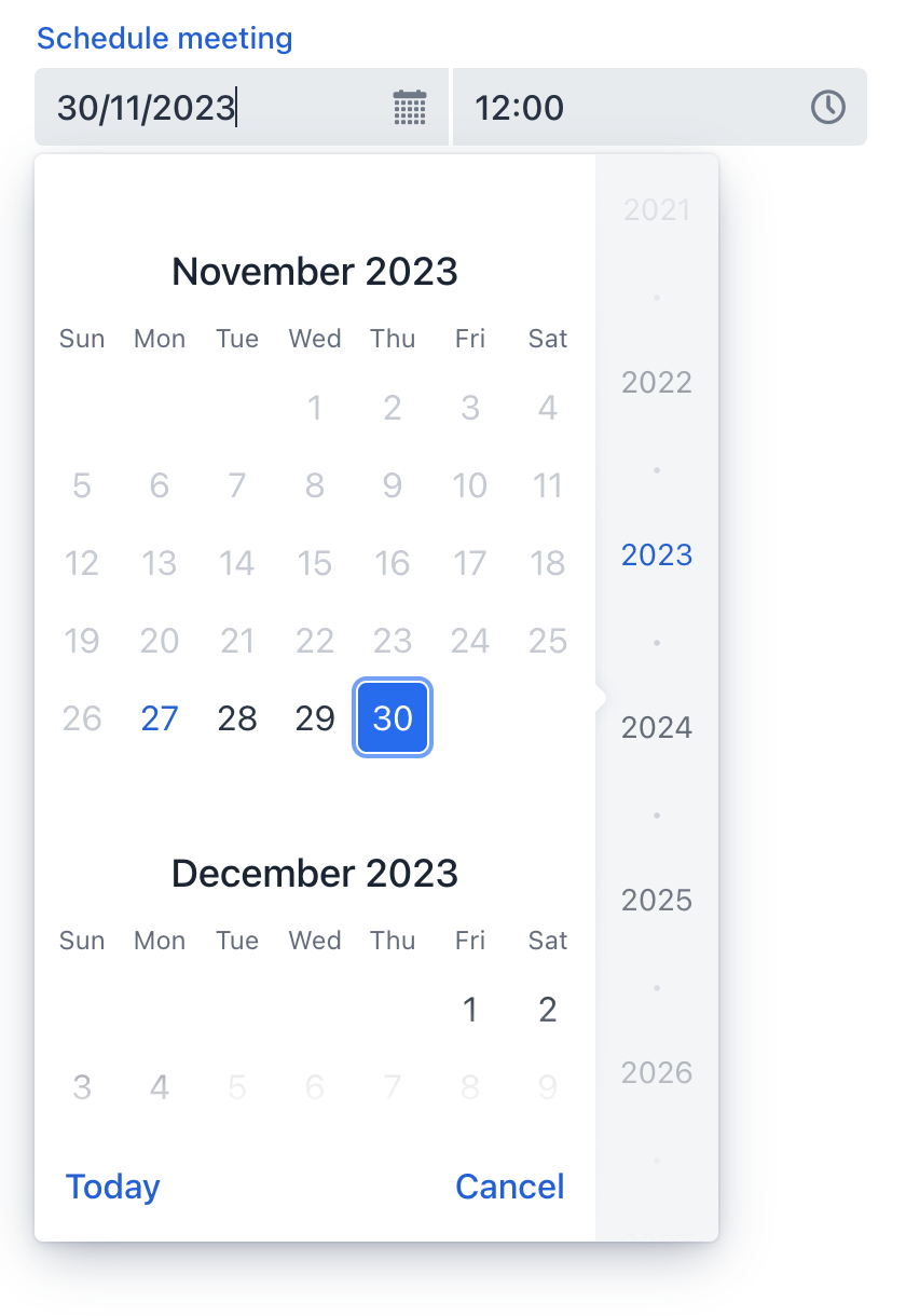
В следующем примере определяется компонент dateTimePicker с меткой:
<dateTimePicker id="dateTimePicker" label="Schedule meeting"/>Типы данных
dateTimePicker - это типизированный компонент, который поддерживает общие типы данных для хранения как даты, так и времени:
-
date -
dateTime -
localDateTime -
offsetTime -
localTime -
offsetDateTime -
time -
localDate
Когда вы связываете компонент с атрибутом сущности, он автоматически принимает тип данных этого атрибута. Чтобы установить тип явно, используйте атрибут datatype.
Привязка данных
Привязка данных (data binding) относится к связыванию визуального компонента с контейнером данных. Изменения в визуальном компоненте или соответствующем контейнере данных могут вызывать обновления друг друга. Смотрите Использование компонентов данных для получения более подробной информации.
В следующем примере создается компонент dateTimePicker, работающий с данными:
<dateTimePicker dataContainer="userDc"
                property="passwordExpiration"
                label="Set password expiration date"/>
Шаг
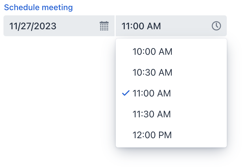
Интервал по умолчанию между элементами, отображаемыми во всплывающей панели времени, установлен в один час. Чтобы изменить этот интервал, используйте атрибут step либо в XML, либо программно. Атрибут step поддерживает гибкую настройку временного интервала с использованием различных единиц времени (chrono units). Для ясности можно указывать значения с суффиксами единиц измерения.
Установка атрибута step в XML-дескрипторе экрана:
<dateTimePicker step="2h"/> (1)
<dateTimePicker step="1600s"/> (2)
<dateTimePicker step="20m"/> (3)
<dateTimePicker step="30"/> (4)| 1 | Интервалы в 2 часа. |
| 2 | Интервалы в 1600 секунд (26 минут 40 секунд). |
| 3 | Интервалы в 20 минут. |
| 4 | Число без суффикса означает минуты. |
То же самое можно сделать в контроллере экрана:
@ViewComponent
private TypedDateTimePicker dateTimePicker;

@Subscribe
public void onInit(final InitEvent event) {
    dateTimePicker.setStep(Duration.ofMinutes(30));
}
Шаг должен равномерно делить час или день. Например, "15 минут", "30 минут" и "2 часа" - это допустимые шаги, а "42 минуты" - нет.
| Всплывающая панель не отображается для шагов менее 15 минут, чтобы избежать показа непрактичного количества вариантов выбора. |
Формат даты
Формат даты и времени по умолчанию в приложении определяется локализованными строками формата. Чтобы использовать другой формат, добавьте собственные строки формата в пакет сообщений.
Чтобы изменить формат для конкретного компонента, используйте его атрибут dateFormat.
Диапазон даты и времени
Чтобы ограничить ввод конкретным диапазоном дат, укажите минимальную и максимальную даты, используя атрибуты max и min.
<dateTimePicker min="2024-01-01T10:30:00" max="2024-12-31T20:30:00"/>Или укажите адаптируемый диапазон даты и времени внутри контроллера экрана:
@ViewComponent
private TypedDateTimePicker dateTimePicker;

@Subscribe
public void onInit(final InitEvent event) {
    dateTimePicker.setMin(LocalDateTime.now());
    dateTimePicker.setMax(LocalDateTime.now().plusDays(7));
}
Валидация
Чтобы проверить значения, введенные в dateTimePicker, добавьте элемент validator. Это позволяет добавить пользовательский критерий проверки или выбрать один из следующих предопределенных валидаторов:
Этот пример демонстрирует, как использовать FutureValidator, чтобы убедиться, что выбранные дата и время находятся в будущем:
<dateTimePicker label="Select a future date and time">
    <validators>
        <future/>
    </validators>
</dateTimePicker>
Варианты темы
Используйте атрибут themeNames для настройки темы компонента.
| Вариант | Описание | Поддерживается в |
|---|---|---|
|
Уменьшает размер компонента. |
Aura, Lumo |
|
Выравнивает значение поля по левому краю. |
Aura, Lumo |
|
Выравнивает значение поля по центру. |
Aura, Lumo |
|
Выравнивает значение поля по правому краю. |
Aura, Lumo |
|
Размещает вспомогательный текст над полем, под меткой. |
Aura, Lumo |
Атрибуты
id - alignSelf - ariaLabel - ariaLabelledBy - autoOpen - classNames - colspan - css - dataContainer - datatype - dateFormat - datePlaceholder - enabled - errorMessage - focusShortcut - height - helperText - label - max - maxHeight - maxWidth - min - minHeight - minWidth - overlayClass - property - readOnly - required - requiredMessage - step - tabIndex - themeNames - timePlaceholder - visible - weekNumbersVisible - width
autoOpen
Определяет, открываются ли всплывающие панели, когда пользователь начинает вводить дату.
-
Если установлено значение
true, всплывающие панели открываются как при вводе данных пользователем, так и при нажатии на соответствующую кнопку или поле. -
Если установлено значение
false, всплывающие панели открываются только при нажатии на соответствующую кнопку.
max
Указывает самые поздние дату и время, которые можно выбрать. Введенное значение должно быть в формате ISO Local Date and Time, например, '2023-12-31T10:00'.
Обработчики
AttachEvent - BlurEvent - ClientValidatedEvent - ComponentValueChangeEvent - DetachEvent - FocusEvent - TypedValueChangeEvent - statusChangeHandler - validator
|
Чтобы сгенерировать заглушку обработчика в Jmix Studio, используйте вкладку Handlers панели инспектора Jmix UI, или команду Generate Handler, доступную на верхней панели контроллера экрана и через меню Code → Generate (Alt+Insert / Cmd+N). |
ClientValidatedEvent
ClientValidatedEvent отправляется веб-компонентом всякий раз, когда он проходит валидацию на стороне клиента.
validator
Добавляет экземпляр валидатора к компоненту. Валидатор должен выбрасывать исключение ValidationException, если значение недействительно. Например:
@Install(to = "dateTimePickerValidation", subject = "validator")
private void dateTimePickerValidationValidator(LocalDateTime date) {
    LocalTime startTime = LocalTime.of(8,0);
    LocalTime endTime = LocalTime.of(16,0);

    if (date != null) {
        boolean isWeekday = date.getDayOfWeek().getValue() >= 1 && date.getDayOfWeek().getValue() <= 5;
        boolean isValidTime = !date.toLocalTime().isBefore(startTime) && !date.toLocalTime().isAfter(endTime);
        if (!isWeekday) {
            throw new ValidationException("Select a weekday");
        }
        if (!isValidTime) {
            throw new ValidationException("Select time from 8.00 to 16.00");
        }
    }
}Смотрите также
Дополнительную информацию смотрите в документации Vaadin.