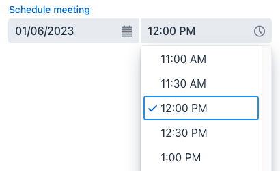
dateTimePicker
dateTimePicker lets users select both a date and a time. If you only need a date or time of the day, use datePicker or timePicker, respectively.
-
XML element:
dateTimePicker -
Java class:
TypedDateTimePicker
Basics
The date and time can be entered directly using a keyboard or selected from overlays. The overlays open when the respective fields are clicked or any input is entered.

The following example defines a datePicker with a label:
<dateTimePicker id="dateTimePicker" label="Schedule meeting"/>Data Binding
Use the dataContainer and property attributes to bind dateTimePicker to data in the screen XML descriptor:
<dateTimePicker dataContainer="userDc"
                property="passwordExpiration"
                label="Set password expiration date"/>
In the example above, the screen has the userDc data container for the User entity, which has the passwordExpiration property. The reference to the data container is specified in the dataContainer attribute. The entity attribute is specified in the property attribute.
Data Type
Data-aware DateTimePicker
The dateTimePicker component that is bound to an entity attribute will have the same data type as that attribute.
Standalone DateTimePicker
If the component is not bound to an entity attribute, you can set the data type manually, using the datatype attribute. The following data types are supported:
-
date -
dateTime -
localDateTime -
offsetTime -
localTime -
offsetDateTime -
time -
localDate
Step
The default interval between the items displayed in the time overlay is set to one hour. A custom step value can be set using the step attribute. This can also be done in the screen controller:
@ViewComponent
private TypedDateTimePicker dateTimePicker;

@Subscribe
public void onInit(final InitEvent event) {
    dateTimePicker.setStep(Duration.ofMinutes(30));
}
The step must divide an hour or day evenly. For example, "15 minutes", "30 minutes" and "2 hours" are valid steps, whereas "42 minutes" isn’t.
| The overlay doesn’t appear for steps less than 15 minutes, to avoid showing an impractical number of choices. |
Date Format
The default date and time format in the application is defined by the localized format strings. To use a different format, add your own format strings to the message bundle.
To change the format for a particular component, use its dateFormat attribute.
Date and Time Range
To restrict the input to a specific range, specify a minimum and maximum value using the max and min attributes. This can also be done in the screen controller:
@ViewComponent
private TypedDateTimePicker dateTimePicker;

@Subscribe
public void onInit(final InitEvent event) {
    dateTimePicker.setMin(LocalDateTime.now());
    dateTimePicker.setMax(LocalDateTime.now().plusDays(7));
}
Apply a validator to set a more specific date and time range.
Validation
To check values entered into dateTimePicker, you can use a validator in a nested validators element.
The following predefined validators are available for dateTimePicker:
In the example below, we will show a FutureValidator usage:
<dateTimePicker label="Select a future date"
                datatype="localDateTime">
    <validators>
        <future/>
    </validators>
</dateTimePicker>
Attributes
id - autoOpen - classNames - colspan - dataContainer - datatype - dateFormat - datePlaceholder - enabled - errorMessage - height - invalid - label - max - maxHeight - maxWidth - min - minHeight - minWidth - property - readOnly - required - requiredIndicatorVisible - requiredMessage - tabIndex - themeNames - timePlaceholder - visible - weekNumbersVisible - width
autoOpen
Defines whether the overlays open when the user starts typing a date.
-
If set to
true, the overlays open both on user input and on clicking their respective button or field. -
If set to
false, the overlays open only on clicking their respective button.
max
Specifies the latest date and time that can be selected. Entered value should be in ISO Local Date and Time format such as '2023-12-31T10:00'.
Handlers
AttachEvent - BlurEvent - ClientValidatedEvent - ComponentValueChangeEvent - DetachEvent - FocusEvent - InvalidChangeEvent - OpenedChangeEvent - TypedValueChangeEvent - statusChangeHandler - validator
|
Чтобы сгенерировать заглушку обработчика в Jmix Studio, используйте вкладку Handlers панели инспектора Jmix UI, или команду Generate Handler, доступную на верхней панели контроллера экрана и через меню Code → Generate (Alt+Insert / Cmd+N). |
ClientValidatedEvent
ClientValidatedEvent is sent by the web component whenever it is validated on the client-side.
InvalidChangeEvent
com.vaadin.flow.component.datepicker.DatePicker.InvalidChangeEvent is sent when the value of the invalid attribute of the component changes.
OpenedChangeEvent
OpenedChangeEvent is sent every time the opened attribute of the component changes. That is, when the calendar is opened or closed.
validator
Adds a validator instance to the component. The validator must throw ValidationException if the value is not valid. For example:
@Install(to = "dateTimePickerValidation", subject = "validator")
private void dateTimePickerValidationValidator(LocalDateTime date) {
    LocalTime startTime = LocalTime.of(8,0);
    LocalTime endTime = LocalTime.of(16,0);

    if (date != null) {
        boolean isWeekday = date.getDayOfWeek().getValue() >= 1 && date.getDayOfWeek().getValue() <= 5;
        boolean isValidTime = !date.toLocalTime().isBefore(startTime) && !date.toLocalTime().isAfter(endTime);
        if (!isWeekday) {
            throw new ValidationException("Select a weekday");
        }
        if (!isValidTime) {
            throw new ValidationException("Select time from 8.00 to 16.00");
        }
    }
}See Also
See Vaadin Docs for more information.