dateTimePicker
An input field to select both a date and a time of the day. To select either a date or a time, use datePicker or timePicker, respectively.
-
XML element:
dateTimePicker -
Java class:
TypedDateTimePicker
Basics
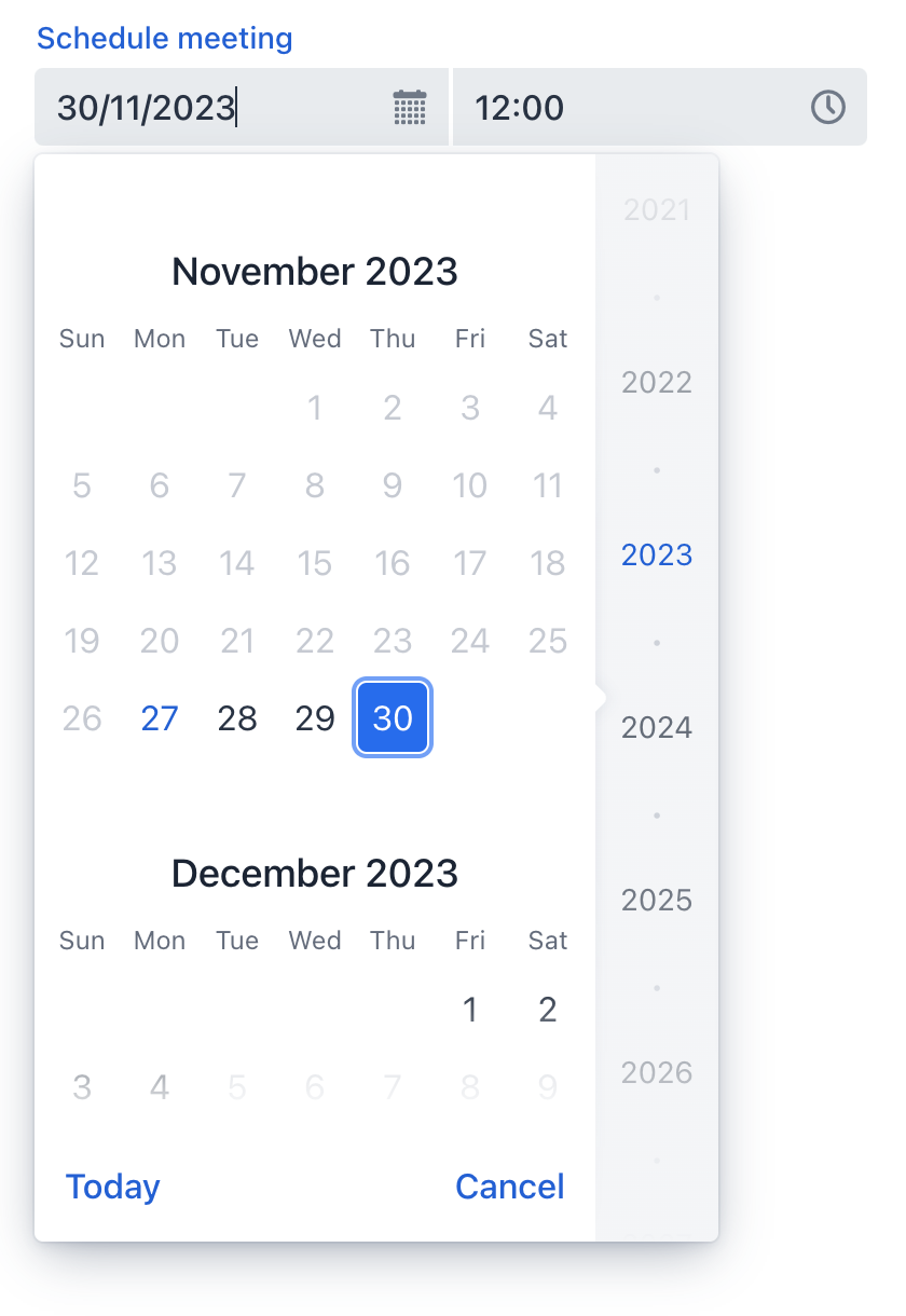
The date and time can be entered directly using the keyboard or selected from the corresponding overlay. The overlay opens when the respective field is clicked or any input is entered.

The following example defines a datePicker with a label:
<dateTimePicker id="dateTimePicker" label="Schedule meeting"/>Data Types
dateTimePicker is a typed component which supports common data types for storing both a date and a time:
-
date -
dateTime -
localDateTime -
offsetTime -
localTime -
offsetDateTime -
time -
localDate
When you bind the component to an entity attribute, it will automatically assume the data type of that attribute. To set the type explicitly, use the datatype attribute.
Data Binding
Data binding refers to linking a visual component to a data container. Changes in the visual component or corresponding data container can trigger updates to one another. See Использование компонентов данных for more details.
The following example produces a data-aware dateTimePicker:
<dateTimePicker dataContainer="userDc"
                property="passwordExpiration"
                label="Set password expiration date"/>
Step
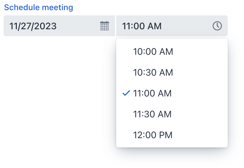
The default interval between the items displayed in the time overlay is set to one hour. A custom step value can be set using the step attribute. This can also be done in the view controller:
@ViewComponent
private TypedDateTimePicker dateTimePicker;

@Subscribe
public void onInit(final InitEvent event) {
    dateTimePicker.setStep(Duration.ofMinutes(30));
}
The step must divide an hour or day evenly. For example, "15 minutes", "30 minutes" and "2 hours" are valid steps, whereas "42 minutes" isn’t.
| The overlay doesn’t appear for steps less than 15 minutes, to avoid showing an impractical number of choices. |
Date Format
The default date and time format in the application is defined by the localized format strings. To use a different format, add your own format strings to the message bundle.
To change the format for a particular component, use its dateFormat attribute.
Date and Time Range
To restrict the input to a specific date range, specify the minimum and maximum dates using the max and min attributes.
<dateTimePicker min="2024-01-01T10:30:00" max="2024-12-31T20:30:00"/>Or specify an adaptable data range within the view controller:
@ViewComponent
private TypedDateTimePicker dateTimePicker;

@Subscribe
public void onInit(final InitEvent event) {
    dateTimePicker.setMin(LocalDateTime.now());
    dateTimePicker.setMax(LocalDateTime.now().plusDays(7));
}
Validation
To check values entered into datePicker, add a validator element. This allows adding a custom validation criterion or select one of the following predefined validators:
This example demonstrates how to use the FutureValidator to ensure that the selected time and date are in the future:
<dateTimePicker label="Select a future date and time">
    <validators>
        <future/>
    </validators>
</dateTimePicker>
Theme Variants
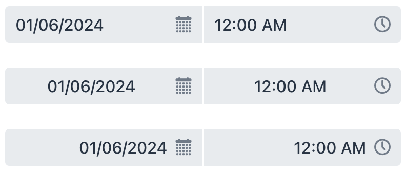
Use the themeNames attribute to adjust text alignment, helper text placement, and component size.
Alignment
Choose among three alignment options: align-left (default), align-right, align-center.

XML code
<dateTimePicker themeNames="align-left"/>
<dateTimePicker themeNames="align-center"/>
<dateTimePicker themeNames="align-right"/>
Helper Text Position
Setting helper-above-field will move the helper text from its default position below the field to above it.

XML code
<dateTimePicker label="Date time picker label" helperText="Helper text"/>
<dateTimePicker themeNames="helper-above-field" label="Date time picker label" helperText="Helper text"/>Attributes
id - alignSelf - ariaLabel - ariaLabelledBy - autoOpen - classNames - colspan - css - dataContainer - datatype - dateFormat - datePlaceholder - enabled - errorMessage - focusShortcut - height - helperText - label - max - maxHeight - maxWidth - min - minHeight - minWidth - overlayClass - property - readOnly - required - requiredMessage - step - tabIndex - themeNames - timePlaceholder - visible - weekNumbersVisible - width
autoOpen
Defines whether the overlays open when the user starts typing a date.
-
If set to
true, the overlays open both on user input and on clicking their respective button or field. -
If set to
false, the overlays open only on clicking their respective button.
max
Specifies the latest date and time that can be selected. Entered value should be in ISO Local Date and Time format such as '2023-12-31T10:00'.
Handlers
AttachEvent - BlurEvent - ClientValidatedEvent - ComponentValueChangeEvent - DetachEvent - FocusEvent - TypedValueChangeEvent - statusChangeHandler - validator
|
Чтобы сгенерировать заглушку обработчика в Jmix Studio, используйте вкладку Handlers панели инспектора Jmix UI, или команду Generate Handler, доступную на верхней панели контроллера экрана и через меню Code → Generate (Alt+Insert / Cmd+N). |
ClientValidatedEvent
ClientValidatedEvent is sent by the web component whenever it is validated on the client-side.
validator
Adds a validator instance to the component. The validator must throw ValidationException if the value is not valid. For example:
@Install(to = "dateTimePickerValidation", subject = "validator")
private void dateTimePickerValidationValidator(LocalDateTime date) {
    LocalTime startTime = LocalTime.of(8,0);
    LocalTime endTime = LocalTime.of(16,0);

    if (date != null) {
        boolean isWeekday = date.getDayOfWeek().getValue() >= 1 && date.getDayOfWeek().getValue() <= 5;
        boolean isValidTime = !date.toLocalTime().isBefore(startTime) && !date.toLocalTime().isAfter(endTime);
        if (!isWeekday) {
            throw new ValidationException("Select a weekday");
        }
        if (!isValidTime) {
            throw new ValidationException("Select time from 8.00 to 16.00");
        }
    }
}See Also
See Vaadin Docs for more information.
