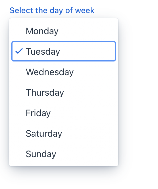
select
select allows users to choose a single value from a list of items presented in an overlay.
-
XML element:
select -
Java class:
JmixSelect
Basics
select is similar to comboBox.
Use select when you don’t need user input and items filtering.
The simplest case of using select is to select a value from an enumeration:
<select itemsEnum="com.company.onboarding.entity.DayOfWeek"
        label="Select the day of week"/>
Data Binding
You can bind a component to an entity and its attributes hold in a data container.
To bind select to an entity attribute:
-
Specify the name of the data container as the dataContainer attribute value.
-
Specify the name of the entity attribute as the property attribute value.
-
Specify the name of the collection data container as the itemsContainer attribute to create a list of items.
<data>
    <instance class="com.company.onboarding.entity.User"
              id="userDc"> (1)
        <fetchPlan extends="_base"> (2)
            <property name="department" fetchPlan="_base"/>
        </fetchPlan>
        <loader id="userDl"/>
    </instance>
    <collection class="com.company.onboarding.entity.Department"
                id="departmentsDc"> (3)
        <fetchPlan extends="_base"/>
        <loader id="departmentsDl">
            <query>
                <![CDATA[select e from Department e]]>
            </query>
        </loader>
    </collection>
</data>
<layout>
    <select dataContainer="userDc"
            property="department"
            itemsContainer="departmentsDc"/> (4)
</layout>| 1 | InstanceContainer for the User entity. |
| 2 | Inline fetch plan of the entity instance located in the container. |
| 3 | CollectionContainer for the Department entity. |
| 4 | select gets departmentsDc as an items container so that the list of departments is displayed. |
Attributes
id - autofocus - classNames - colspan - css - dataContainer - emptySelectionAllowed - emptySelectionCaption - enabled - errorMessage - height - helperText - invalid - itemsContainer itemsEnum - label - maxHeight - maxWidth - minHeight - minWidth - pattern - placeholder - property - readOnly - required - requiredIndicatorVisible - tabIndex - themeNames - title - value - valueChangeMode - valueChangeTimeout - visible - width
emptySelectionAllowed
Sets whether the user is allowed to select nothing. When set true a special empty item is shown to the user.
Default is false.
The empty selection item can be customized with the emptySelectionCaption attribute.
emptySelectionCaption
Sets the empty selection caption when emptySelectionAllowed = true. The caption is shown for the empty selection item in the drop-down.
When the empty selection item is selected, the select shows the value provided by itemLabelGenerator for the null item, or the string set with the placeholder attribute or an empty string if not placeholder is set.
Handlers
AttachEvent - BlurEvent - ClientValidatedEvent - ComponentValueChangeEvent - DetachEvent - FocusEvent - InvalidChangeEvent - OpenedChangeEvent - itemEnabledProvider - itemLabelGenerator - statusChangeHandler - validator
|
Чтобы сгенерировать заглушку обработчика в Jmix Studio, используйте вкладку Handlers панели инспектора Jmix UI, или команду Generate Handler, доступную на верхней панели контроллера экрана и через меню Code → Generate (Alt+Insert / Cmd+N). |
InvalidChangeEvent
com.vaadin.flow.component.select.Select.InvalidChangeEvent is sent when the invalid state changes.
OpenedChangeEvent
com.vaadin.flow.component.select.Select.OpenedChangeEvent is sent when the overlay opened state changes.
itemEnabledProvider
itemEnabledProvider is applied to each item of select to determine whether the item should be enabled (true) or disabled (false). Disabled items are displayed as grayed out and the user cannot select them. All the items are enabled by default.
@Install(to = "select", subject = "itemEnabledProvider")
private boolean selectItemEnabledProvider(final Department department) {
    if (department != null) {
        return department.getHrManager() != null;
    }
    return true;
}See Also
See the Vaadin Docs for more information.