progressBar
A visual indicator to provide feedback about the status and completion of an ongoing task, such as a file transfer, loading data, complex computations, or any other lengthy task. It helps users understand how much time a task will take.
-
XML-element:
progressBar -
Java class:
ProgressBar
Basics
A standard progress bar takes values between 0.0 and 1.0, representing the progress of a task from 0% to 100%.

XML code
<progressBar value="0.5"/>Progress Updates
The progress value is commonly updated within the context of an ongoing task. This allows the progress bar to accurately reflect the current state of the task.
Consider an example of a simple background task that updates the progressBar value:
XML code
<progressBar id="progressBar"/>Java code
@ViewComponent
protected ProgressBar progressBar; (1)
@Autowired
protected BackgroundWorker backgroundWorker;

protected BackgroundTaskHandler<Void> taskHandler;

private static final int ITERATIONS = 6;

@Subscribe
protected void onInit(InitEvent event) {  (2)
    taskHandler = backgroundWorker.handle(createBackgroundTask());
    taskHandler.execute();
}

protected BackgroundTask<Integer, Void> createBackgroundTask () { (3)
    return new BackgroundTask<>(100, TimeUnit.SECONDS) {
        @Override
        public Void run(TaskLifeCycle<Integer> taskLifeCycle) throws Exception {
            for (int i=1; i< ITERATIONS; i++) {
                TimeUnit.SECONDS.sleep(1);
                taskLifeCycle.publish(i);
            }
            return null;
        }

        @Override
        public void progress (List<Integer> changes) {
            double lastValue = changes.get(changes.size() - 1);
            double value = lastValue/ITERATIONS;
            progressBar.setValue(value); (4)
        }
    };
}| 1 | Inject the progress bar to access it in the controller class. |
| 2 | When this view opens, initiate a task to run in the background. |
| 3 | Define a method to create a simple background task. |
| 4 | As the task progresses, update the progress value to reflect its current status. |
Modes
A progress bar can either be determinate or indeterminate depending on the nature of the task and the availability of progress information.
Determinate
By default, progressBar shows progress in the determinate mode. This mode provide users with a visual representation of remaining time to complete the task.
XML code
<progressBar id="determinateMode"/>Use a determinate progress bar when the time required for completion is known in advance or the progress can be tracked.
Indeterminate
By setting the indeterminate attribute to true you can switch the progress bar to operate in the indeterminate mode. When in indeterminate mode progressBar cycles repeatedly along the length of the bar without showing a specific progress value.

XML code
<progressBar id="indeterminateMode" indeterminate="true"/>Use this mode for tasks which do not share a progress value or to communicate that the task is running continuously.
Value Range
By default, a progress bar takes values from 0.0 to 1.0, representing 0% and 100% respectively. This is the standard behavior that can be changed using the min and max attributes.
For instance, if you have a task with 10 steps, you can set min="1" and max="10" to match the task’s progress range. Reaching the 5th step indicates that the progress value has reached 5 as well:
XML code
<progressBar min="0" max="10" value="5"/>Progress Dialog
If it is necessary for the user to wait for the completion of a task, a background task dialog can be used.
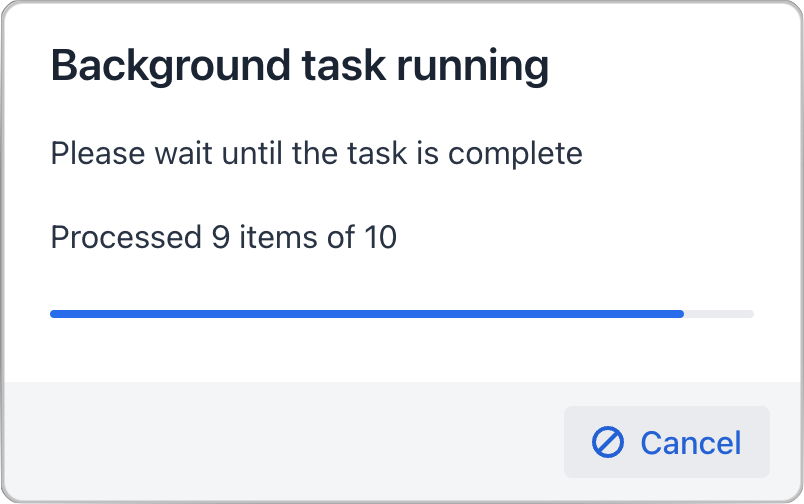
This dialog blocks user interaction with the rest of the application until the task is either completed or is canceled by the user.
Attributes
id - alignSelf - classNames - colspan - css - height - indeterminate - max - maxHeight - maxWidth - min - minHeight - minWidth - themeNames - value - visible - width
themeNames
Sets a different theme to change component’s colors and draw user attention.
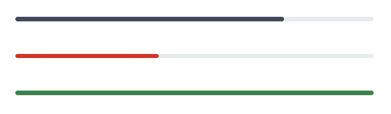
-
contrast– applies more contrasting color scheme. -
error– signals of an error state. -
success– indicates success.
Handlers
|
Чтобы сгенерировать заглушку обработчика в Jmix Studio, используйте вкладку Handlers панели инспектора Jmix UI, или команду Generate Handler, доступную на верхней панели контроллера экрана и через меню Code → Generate (Alt+Insert / Cmd+N). |
See Also
See Vaadin Docs for more information.