dataGrid
dataGrid is designed to display and sort tabular data and provides means to manipulate rows and columns with great performance due to the lazy loading of data while scrolling.
-
XML element:
dataGrid -
Java class:
DataGrid
Basics
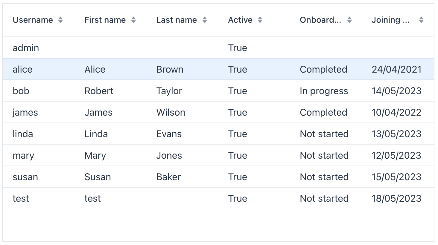
An example of dataGrid declaration in the XML view descriptor is shown below:
<data readOnly="true">
    <collection id="usersDc"
                class="com.company.onboarding.entity.User"> (1)
        <fetchPlan extends="_base"/>
        <loader id="usersDl">
            <query>
                <![CDATA[select e from User e order by e.username]]>
            </query>
        </loader>
    </collection>
</data>
<layout>
    <dataGrid id="usersTable"
              width="100%"
              minHeight="20em"
              dataContainer="usersDc"> (2)
        <columns> (3)
            <column property="username"/>
            <column property="firstName"/>
            <column property="lastName"/>
            <column property="active"/>
            <column property="onboardingStatus"/>
            <column property="joiningDate"/>
        </columns>
    </dataGrid>
</layout>| 1 | Collection container for the User entity. |
| 2 | dataGrid is bound to the usersDc container using the dataContainer attribute. |
| 3 | The columns element defines which entity attributes are shown in the data grid columns. |
Data Binding
Declarative Binding
Usually, you bind dataGrid to data declaratively in the view XML descriptor using the dataContainer attribute. It should refer to a collection container.
Using Key-Value Containers
You can bind the data grid to a key-value container to display the results of a query that returns scalar values and/or aggregates. For example:
<data readOnly="true">
    <keyValueCollection id="statusesDc">
        <loader id="statusesLoader">
            <query>
                <![CDATA[select o.department, o.onboardingStatus,
                count(o.onboardingStatus) from
                User o group by o.department, o.onboardingStatus]]>
            </query>
        </loader>
        <properties>
            <property name="department" datatype="string"/>
            <property name="onboardingStatus" datatype="int"/>
            <property name="count" datatype="int"/>
        </properties>
    </keyValueCollection>
</data>
<layout>
    <dataGrid width="100%" dataContainer="statusesDc">
        <columns>
            <column property="department"/>
            <column property="onboardingStatus"/>
            <column property="count"/>
        </columns>
    </dataGrid>
</layout>
Programmatic Binding
If you need to define a data container programmatically in the view controller, set the metaClass attribute instead of dataContainer in XML descriptor:
<dataGrid width="100%" id="dataGrid" metaClass="User">
    <columns>
        <column property="firstName"/>
        <column property="lastName"/>
        <column property="username"/>
        <column property="joiningDate"/>
        <column property="onboardingStatus"/>
    </columns>
</dataGrid>
In the view controller, use the ContainerDataGridItems class to bind the data grid to a data container:
@ViewComponent
private DataGrid<User> dataGrid;

@ViewComponent
private CollectionContainer<User> usersDc;

@Subscribe
public void onInit(InitEvent event) {
    dataGrid.setItems(new ContainerDataGridItems<>(usersDc));
}
Columns
The set of columns for a data grid is defined in the columns nested element. columns can have the following attributes:
-
includeAllincludes all the attributes from the fetch plan that is defined in the data container.In the example below, we will show all the attributes from the fetch plan used in
usersDc:<dataGrid width="100%" dataContainer="usersDc"> <columns includeAll="true"/> </dataGrid>If the entity fetch plan contains a reference attribute, this attribute will be displayed according to its instance name. If you want to show a specific nested attribute, define it in the fetch plan as well as in the
columnelement:<data readOnly="true"> <collection class="com.company.onboarding.entity.UserStep" id="userStepsDc"> <fetchPlan extends="_base"> <property name="user" fetchPlan="_base"> <property name="department" fetchPlan="_base"/> </property> <property name="step" fetchPlan="_base"/> </fetchPlan> <loader id="userStepsDl"> <query> <![CDATA[select e from UserStep e]]> </query> </loader> </collection> </data> <layout> <dataGrid width="100%" dataContainer="userStepsDc"> <columns includeAll="true"> <column property="user.department.name"/> </columns> </dataGrid> </layout> -
excludecontains a comma-separated list of attributes that should not be displayed in the data grid.In the example below, we will show all the attributes excluding
id,version,sortValue:<dataGrid width="100%" dataContainer="userStepsDc"> <columns includeAll="true" exclude="id,version,sortValue"/> </dataGrid>
Column
Each column is described in a nested column element.
|
To add |
autoWidth
Enables or disables automatic width for this column.
When autoWidth = true, the column width is based on the column contents.
By default, this attribute is set to false.
editable
Specifies that an editor component will be created for this column.
See also Inline Editing.
filterable
Sets the filtering for a column. If filtering is enabled, a filter button will be added to the column header. Filtering is disabled by default.
footer
Sets a footer text to the column.
The attribute value can either be the text itself or a key in the message bundle. In case of a key, the value should begin with the msg:// prefix.
frozen
Sets whether to freeze or unfreeze this column.
| Columns are frozen in-place, freeze columns from left to right for a consistent outcome. |
header
Sets a header text to the column.
The attribute value can either be the text itself or a key in the message bundle. In case of a key, the value should begin with the msg:// prefix.
key
Sets the user-defined identifier to map this column. The key can be used to fetch the column later with the getColumnByKey(String) method.
The key has to be unique within the data grid, and it can’t be changed after set once.
property
property specifies the name of an entity attribute displayed in the column. It can be either an attribute of the entity from the data container or a linked entity (use dot notation to traverse the object graph). For example:
<columns>
    <column property="user.firstName" sortable="false"/>
    <column property="user.lastName" sortable="false"/>
    <column property="step" frozen="true" sortable="true"/>
    <column property="dueDate" editable="true" sortable="true"/>
    <column property="user.department.name" sortable="false"/>
</columns>
resizable
When set to true, the column is user-resizable. By default, this attribute is set to false.
The column size changes can be tracked with ColumnResizeEvent.
sortable
Sets whether the user can sort this column or not.
The dataGrid sorting events can be tracked by SortEvent.
Column Headers Filtering
| This is a preview feature. Its look and feel, as well as implementation details, may change significantly in future releases. |
Data in dataGrid can be filtered using property filters embedded into column headers.
You can define which columns should have a filter using the filterable XML attribute. Filterable columns have the "funnel" icon ( ) in their headers. If the user clicks this icon, a dialog with the property filter condition appears. If a condition is set, the icon in that column is highlighted.
To make sure the filter icon is always visible, set an appropriate width for the column using the width or autoWidth attribute. Don’t make the column resizable, otherwise users will be able to shrink the column width and lose the filter icon.
For example:
<dataGrid dataContainer="usersDc"
          width="100%"
          id="usersDataGrid">
    <columns>
        <column property="firstName" filterable="true"
                width="15em"/>
        <column property="lastName" filterable="true"
                autoWidth="true"/>
        <column property="username"/>
        <column property="active"/>
        <column property="joiningDate"/>
        <column property="onboardingStatus"/>
    </columns>
</dataGrid>
Property filters in column headers work in the same way as standalone property filters and genericFilter - they add conditions to the data loader. In the standard flow, the conditions are translated to the JPQL query and filter data on the database level.
Filterable columns can be used together with propertyFilter and genericFilter components. Conditions of all filters are combined by logical AND.
Currently, column filter conditions are not bound to the page URL. It means that if a user applies a filter and then navigates to a detail view and back, the filter will be cleared.
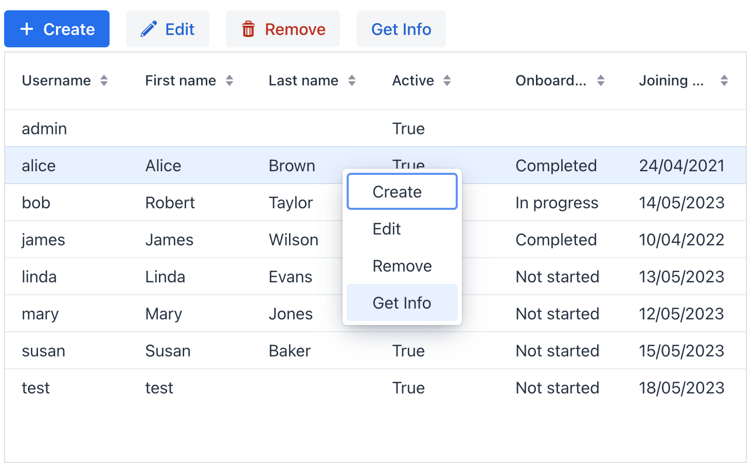
Actions
The dataGrid component implements the HasActions interface and can contain custom actions, as well as standard list actions.
Data grid actions are defined in the nested actions element.
|
To add |
If an action has a text, it is displayed as an item of the data grid context menu. Additionally, a data grid action can be assigned to a button located anywhere on the view.
You can create an hbox container to show action buttons above the data grid.
<hbox id="buttonsPanel" classNames="buttons-panel"> (1)
    <button id="createBtn" action="usersDataGrid.create"/>
    <button id="editBtn" action="usersDataGrid.edit"/>
    <button id="removeBtn" action="usersDataGrid.remove"/>
    <button id="infoBtn" action="usersDataGrid.getInfo"/>
</hbox>
<dataGrid width="100%" dataContainer="usersDc" id="usersDataGrid">
    <columns>
        <column property="username"/>
        <column property="firstName"/>
        <column property="lastName"/>
        <column property="active"/>
        <column property="onboardingStatus"/>
        <column property="joiningDate"/>
    </columns>
    <actions>
        <action id="create" type="list_create"/> (2)
        <action id="edit" type="list_edit"/>
        <action id="remove" type="list_remove"/>
        <action id="getInfo" text="Get Info"/> (3)
    </actions>
</dataGrid>| 1 | Define a buttonsPanel hbox container above the data grid. |
| 2 | Define the list_create standard action. |
| 3 | Define the getInfo custom action. |
Using Renderers
Renderers are used to customize the display of data in a data grid. For example, you could use a renderer to:
-
Format dates or numbers.
-
Display custom icons or images.
-
Create interactive elements, such as buttons or links.
-
Show different content based on the value of the cell.
Renderers can be defined in three ways:
-
Declaratively in XML
There are a few pre-built renderers that can be assigned to a column in XML:
-
numberRenderer -
localDateRenderer -
localDateTimeRendererThey accept a
formatstring. For example:<column property="joiningDate"> <localDateRenderer format="MMM dd, yyyy"/> </column>To add a renderer in Jmix Studio, select the
columnelement in the view descriptor XML or in the Jmix UI structure panel and click on the Add→<Some>Renderer button in the Jmix UI inspector panel.
-
-
Using @Supply Annotation
Renderers can be supplied in a view controller using the
@Supplyannotation. Methods annotated with@Supplyreturn a value that will be passed as an input parameter to a method defined bysubject.A custom renderer can be assigned to a column using the
rendererhandler which is available on the Handlers tab of the Jmix UI inspector for anycolumnelement. -
Using addColumn() and addComponentColumn()
The
addColumn()andaddComponentColumn()methods allow you to add columns to the data grid.You can configure the added columns to use a renderer to show the data.
In the following example, we will add a column displaying the user’s picture:
@ViewComponent private DataGrid<User> usersDtGr; @Autowired private FileStorage fileStorage; @Subscribe public void onInit(InitEvent event) { Grid.Column<User> pictureColumn = usersDtGr.addComponentColumn(user -> { (1) FileRef fileRef = user.getPicture(); if (fileRef != null) { Image image = uiComponents.create(Image.class); (2) image.setWidth("30px"); image.setHeight("30px"); image.setClassName("user-picture"); StreamResource streamResource = new StreamResource( fileRef.getFileName(), () -> fileStorage.openStream(fileRef)); image.setSrc(streamResource); (3) return image; (4) } else { return new Span(); } }) .setHeader("Picture") .setAutoWidth(true) .setFlexGrow(0); usersDtGr.setColumnPosition(pictureColumn,0); }1 Adds a new column that shows the imagecomponent.2 The Imagecomponent instance is created using theUiComponentsfactory.3 imagegets its content from the givenStreamResourceby the reference stored in thepictureattribute of theUserentity.4 The addComponentColumn()method returns the visual component to be shown in the column cells.
Local Date Renderer
The LocalDateRenderer is responsible for presenting dates in the form of LocalDate values.
Within the data grid’s column element, there is a localDateRenderer sub-element that includes an optional nullRepresentation attribute and a mandatory format string attribute.
<column property="joiningDate">
    <localDateRenderer format="MMM dd, yyyy"/>
</column>The nullRepresentation attribute is used to specify the textual representation of null values.
Below is an example using LocalDateRenderer with the addColumn() method:
@ViewComponent
private DataGrid<User> usersDtGr;

@Subscribe
public void onInit(InitEvent event) {
    usersDtGr.addColumn(new LocalDateRenderer<>(
                    User::getJoiningDate,
                    () -> DateTimeFormatter.ofLocalizedDate(
                            FormatStyle.MEDIUM)))
            .setHeader("Joining date");
}
Local Date Time Renderer
The LocalDateTimeRenderer is responsible for presenting dates in the form of LocalDateTime values.
Within the data grid’s column element, there is a localDateTimeRenderer sub-element that includes an optional nullRepresentation attribute and a mandatory format string attribute.
<column property="passwordExpiration">
    <localDateTimeRenderer format="dd/MM/YYYY HH:mm:ss"/>
</column>
The nullRepresentation attribute is used to specify the textual representation of null values.
Number Renderer
The NumberRenderer allows you to display numbers in a specified format within the grid cells. It is particularly useful for rendering various types of numbers, including floating-point values.
Within the data grid’s column element, there is a numberRenderer sub-element that includes an optional nullRepresentation attribute and a mandatory format or numberFormat attribute.
<column property="factor">
    <numberRenderer numberFormat="#,#00.0000"/>
</column>
The nullRepresentation attribute is used to specify the textual representation of null values.
The numberFormat attribute follows the formatting rules and syntax of the java.text.DecimalFormat class.
|
|
Text Renderer
TextRenderer is a renderer for presenting simple plain-text string values.
In the example below, a custom text is displayed in the column:
<column key="status" header="Status"/>@Supply(to = "userStepsDataGrid.status", subject = "renderer")
private Renderer<UserStep> userStepsDataGridStatusRenderer() {
return new TextRenderer<>(userStep ->
isOverdue(userStep) ? "Overdue!" : "");
}Component Renderer
The example below shows how to define a column with custom renderer which displays a checkbox:
<column key="completed" width="4em" flexGrow="0"/>@Supply(to = "userStepsDataGrid.completed", subject = "renderer")
private Renderer<UserStep> userStepsDataGridCompletedRenderer() {
return new ComponentRenderer<>(userStep -> {
JmixCheckbox checkbox = uiComponents.create(JmixCheckbox.class);
checkbox.setValue(userStep.getCompletedDate() != null);
checkbox.addValueChangeListener(e -> {
// ...
});
return checkbox;
});
}Inline Editing
dataGrid provides inline editing that allows users to manipulate grid data.
The columns with the editable = true attribute show components to edit the attributes of the corresponding entity. The component type for each editable column is selected automatically based on the type of the corresponding entity attribute.
The editorBuffered attribute defines whether the inline editor must be opened in buffered mode or not.
-
To make some column editable, set the value of the editable attribute to
true. -
Then you should start editing of a row either programmatically as described in the Vaadin documentation, or by defining the editorActionsColumn element, for example:
<dataGrid width="100%" dataContainer="usersDc" id="editableUsersTable">
    <columns>
        <column property="username"/>
        <column property="firstName" editable="true"/>
        <column property="lastName" editable="true"/>
        <column property="active" editable="true"/>
        <column property="onboardingStatus"/>
        <editorActionsColumn width="8em" flexGrow="0">
            <editButton text="Edit" icon="PENCIL"/>
            <closeButton text="Close" icon="CLOSE"/>
        </editorActionsColumn>
    </columns>
</dataGrid>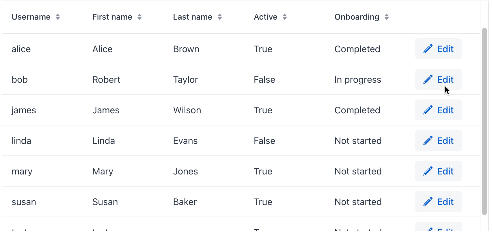
editorActionsColumn
The editorActionsColumn element is used to create a custom column with edit buttons.
<editorActionsColumn width="16em" flexGrow="0">
    <editButton text="Edit" icon="PENCIL"/>
    <saveButton icon="CHECK" themeNames="success"/>
    <cancelButton icon="CLOSE" themeNames="error"/>
    <closeButton text="Close" icon="CLOSE"/>
</editorActionsColumn>
The following buttons can be included to the editor column:
-
editButton- starts editing of an item. Suitable for both buffered and non buffered mode. -
saveButton- saves changes made in editor components. Suitable for buffered mode only. -
cancelButton- discards changes made in editor components. Suitable for buffered mode. -
closeButton- closes the edit mode. Suitable for non buffered mode only.
Each button supports a limited set of attributes of standard button: text, icon, title, classNames, themeNames, iconAfterText.
The editor column is added relatively to other columns. In case of includeAll="true", the editor column is added at the end.
DataGridEditor
The io.jmix.flowui.component.grid.editor.DataGridEditor interface provides additional editor functionality: configure an editor, open the editor, save and cancel a row editing, and utility methods for defining column edit components.
To support framework mechanisms like data containers, value sources, etc., the column editor component must be added using DataGridEditor methods (DataGridEditor#setColumnEditorComponent()) instead of direct column API Column#setEditorComponent().
|
See the example:
@Autowired
private UiComponents uiComponents;

@ViewComponent
private DataGrid<User> editableUserTable;

@Subscribe
public void onInit(InitEvent event) {
    DataGridEditor<User> editor = editableUserTable.getEditor(); (1)

    editor.setColumnEditorComponent("timeZoneId", generationContext -> {
        //noinspection unchecked
        JmixComboBox<String> timeZoneField = uiComponents.create(JmixComboBox.class); (2)
        timeZoneField.setItems(List.of(TimeZone.getAvailableIDs()));
        timeZoneField.setValueSource(generationContext.getValueSourceProvider().getValueSource("timeZoneId"));
        timeZoneField.setWidthFull();
        timeZoneField.setClearButtonVisible(true);
        timeZoneField.setRequired(true);
        //noinspection unchecked,rawtypes
        timeZoneField.setStatusChangeHandler(((Consumer) generationContext.getStatusHandler())); (3)

        return timeZoneField; (4)
    });
}| 1 | Get the instance of DataGridEditor. |
| 2 | The JmixComboBox component instance is created using the UiComponents factory. |
| 3 | Set StatusChangeHandler. |
| 4 | The setColumnEditorComponent() method returns the visual component to be shown as the column editor component. |
SupportsStatusChangeHandler
By default, field components (for example, textField, comboBox) display error messages in a label above them. Such behaviour has disadvantages in case of limited area of edit cell. The io.jmix.flowui.component.SupportsStatusChangeHandler interface enables to define different way of displaying error messages. Components that implement this interface support error handling delegation.
By default, the inline editor uses StatusChangeHandler to set error message of a component as its title.
Double-click Editing
Sometimes it is necessary to open the inline editor by double-clicking. See the example:
<dataGrid width="100%" dataContainer="usersDc" id="dblClickTable">
    <columns>
        <column property="username"/>
        <column property="firstName" editable="true"/>
        <column property="lastName" editable="true"/>
        <column property="active" editable="true"/>
        <column property="onboardingStatus"/>
    </columns>
</dataGrid>
@ViewComponent
private DataGrid<User> dblClickTable;
@Subscribe
public void onInit(InitEvent event) {
DataGridEditor<User> tableEditor = dblClickTable.getEditor();
dblClickTable.addItemDoubleClickListener(e -> {
tableEditor.editItem(e.getItem());
Component editorComponent = e.getColumn().getEditorComponent();
if (editorComponent instanceof Focusable) {
((Focusable) editorComponent).focus();
}
});
}Sorting by Multiple Columns
dataGrid supports sorting by multiple columns. You can configure it using the following XML attributes:
multiSortOnShiftClickOnly
When set to true, multi-sorting is activated only when clicking on the column header while holding the Shift key. By default, it is set to false.
multiSortPriority
When set to APPEND, the clicked column is added to the end of the list of sorted columns. If set to PREPEND (which is the default), the clicked column is added to the beginning of the list.
For example:
<dataGrid width="100%"
          dataContainer="usersDc"
          multiSort="true"
          multiSortOnShiftClickOnly="true"
          multiSortPriority="APPEND">
Aggregating
dataGrid supports the aggregation of values in rows.
The following operations are supported:
-
SUM- calculate the sum; -
AVG- calculate the average value; -
COUNT- calculate the total number; -
MIN- find the minimum value; -
MAX- find the maximum value.
To enable aggregation for a data grid, you should:
-
Set the
aggregatableattribute totrue. -
Set the
aggregationelement for aggregated grid columns. -
Set the
typeattribute for the aggregation element, which defines the aggregation function.
| To define aggregation in Jmix Studio, select the aggregated grid column in the view descriptor XML or in the Jmix UI structure panel and click on the Add→Aggregation button in the Jmix UI inspector panel. |
The aggregated values are shown in an additional row.
The aggregationPosition attribute allows you to specify the location of the aggregation row: TOP or BOTTOM. BOTTOM is used by default.
For example:
<dataGrid width="100%"
          dataContainer="stepsDc"
          aggregatable="true"
          aggregationPosition="TOP">
    <columns>
        <column property="name"/>
        <column property="duration">
            <aggregation type="AVG"
                         cellTitle="msg://aggregation.cellTitle"/> (1)
        </column>
        <column property="sortValue"/>
        <column property="factor">
            <aggregation type="AVG">
                <formatter>
                    <number format="#,##0.00"/> (2)
                </formatter>
            </aggregation>
        </column>
    </columns>
</dataGrid>| 1 | The cellTitle attribute defines a hint displayed in a popup when a user hovers the mouse cursor on the aggregated value. |
| 2 | You can specify formatter to display the aggregated value in the format other than the standard for this Datatype. |
The aggregation element can also contain the strategyClass attribute specifying a class implementing the AggregationStrategy interface.
public class DataGridUserStatusAggregation implements AggregationStrategy<OnboardingStatus, String> {

    @Autowired
    public Messages messages;

    @Override
    public String aggregate(Collection<OnboardingStatus> propertyValues) {
        OnboardingStatus mostFrequent = null;
        long max = 0;

        if (CollectionUtils.isNotEmpty(propertyValues)) {
            for (OnboardingStatus status : OnboardingStatus.values()) {
                long current = propertyValues.stream()
                        .filter(status :: equals)
                        .count();

                if (current > max) {
                    mostFrequent = status;
                    max = current;
                }
            }
        }

        if (mostFrequent != null) {
            String key = OnboardingStatus.class.getSimpleName() + "." + mostFrequent.name();
            return String.format("%s: %d/%d", messages.getMessage(OnboardingStatus.class, key), max, propertyValues.size());
        }

        return null;
    }

    @Override
    public Class<String> getResultClass() {
        return String.class;
    }
}
<dataGrid width="100%"
dataContainer="usersDc"
aggregatable="true"
aggregationPosition="TOP">
<columns>
<column property="firstName"/>
<column property="lastName"/>
<column property="onboardingStatus">
<aggregation
strategyClass="com.company.onboarding.view.component.datagrid.DataGridUserStatusAggregation"/>
</column>
</columns>
</dataGrid>Attributes
id - alignSelf - allRowsVisible - classNames - colspan - columnReorderingAllowed - css - dataContainer - detailsVisibleOnClick - dropMode - editorBuffered - enabled - height - maxHeight - maxWidth - metaClass - minHeight - minWidth - multiSort - multiSortOnShiftClickOnly - multiSortPriority - nestedNullBehavior - pageSize - rowDraggable - selectionMode - tabIndex - themeNames - visible - width
allRowsVisible
If the allRowsVisible attribute is set to true, the data grid’s height is defined by its rows. All items are fetched from the DataProvider, and dataGrid shows no vertical scroll bar.
allRowsVisible = true disables the data grid’s virtual scrolling so that all the rows are rendered in the DOM at once. If the data grid has a large number of items, using the feature is discouraged to avoid performance issues.
|
columnReorderingAllowed
dataGrid provides the drag-and-drop functionality allowing users to change the order in which columns are displayed within the data grid.
The column reordering functionality is disabled by default. To enable it, set the columnReorderingAllowed attribute to true.
The column order changes can be tracked with ColumnReorderEvent.
detailsVisibleOnClick
Sets whether the item details can be opened and closed by clicking the rows or not.
dropMode
Sets the drop mode of this drop target. When set to not null, dataGrid fires drop events upon data drop over the data grid or the data grid rows.
Four different drop modes are supported: BETWEEN, ON_TOP, ON_TOP_OR_BETWEEN, and ON_GRID.
editorBuffered
Sets the Editor buffered mode. When the editor is in buffered mode, changes are only committed when the user clicks the save button. In unbuffered mode valid changes are automatically committed.
See Inline Editing.
nestedNullBehavior
Sets the behavior when parsing nested properties which may contain null values in the property chain.
pageSize
Sets the page size, which is the number of items fetched at a time from the data provider. See the com.vaadin.flow.component.grid.Grid.setPageSize() method.
Default is 50.
Handlers
AttachEvent - BlurEvent - CellFocusEvent - ColumnReorderEvent - ColumnResizeEvent - DetachEvent - FocusEvent - GridDragEndEvent - GridDragStartEvent - GridDropEvent - ItemClickEvent - ItemDoubleClickEvent - SortEvent - classNameGenerator - dataGenerator - dragFilter - dropFilter
|
Чтобы сгенерировать заглушку обработчика в Jmix Studio, используйте вкладку Handlers панели инспектора Jmix UI, или команду Generate Handler, доступную на верхней панели контроллера экрана и через меню Code → Generate (Alt+Insert / Cmd+N). |
CellFocusEvent
com.vaadin.flow.component.grid.CellFocusEvent fired when a cell in the data grid is focused. Corresponds to the grid-cell-focus DOM event.
ColumnReorderEvent
com.vaadin.flow.component.grid.ColumnReorderEvent fired when the columns in the data grid are reordered. Corresponds to the column-reorder-all-columns DOM event.
ColumnResizeEvent
com.vaadin.flow.component.grid.ColumnResizeEvent fired when a data grid column is resized by the user. Corresponds to the column-drag-resize DOM event.
GridDragEndEvent
com.vaadin.flow.component.grid.dnd.GridDragEndEvent - drag end event of dataGrid rows. Corresponds to the grid-dragend DOM event.
GridDragStartEvent
com.vaadin.flow.component.grid.dnd.GridDragStartEvent - drag start event of dataGrid rows. Corresponds to the grid-dragstart DOM event.
GridDropEvent
com.vaadin.flow.component.grid.dnd.GridDropEvent - drop event that occurs on the data grid or its rows. Corresponds to the grid-drop DOM event.
ItemClickEvent
com.vaadin.flow.component.grid.ItemClickEvent fired when a data grid item is clicked. Corresponds to the item-click DOM event.
ItemDoubleClickEvent
com.vaadin.flow.component.grid.ItemDoubleClickEvent fired when a data grid item is double-clicked. Corresponds to the item-double-click DOM event.
SortEvent
com.vaadin.flow.data.event.SortEvent - event describing a change in sorting of a DataProvider. Fired by SortNotifiers.
classNameGenerator
classNameGenerator is used for generating CSS class names for all the cells in the rows in this data grid.
dataGenerator
Adds a data generator for the data grid. If the generator was already added, does nothing. See the com.vaadin.flow.data.provider.HasDataGenerators interface.
dragFilter
Sets the drag filter for this drag source.
When the rowDraggable = true, by default all the visible rows can be dragged.
A drag filter function can be used to specify the rows that are available for dragging. The function receives an item and returns true if the row can be dragged, false otherwise. See com.vaadin.flow.component.grid.Grid.
dropFilter
Sets the drop filter for this drag target.
When the drop mode of the grid has been set to one of BETWEEN, ON_TOP or ON_TOP_OR_BETWEEN, by default all the visible rows can be dropped over.
A drop filter function can be used to specify the rows that are available for dropping over. The function receives an item and should return true if the row can be dropped over, otherwise. See com.vaadin.flow.component.grid.Grid.
See Also
See the Vaadin Docs for more information.