passwordField
Basics
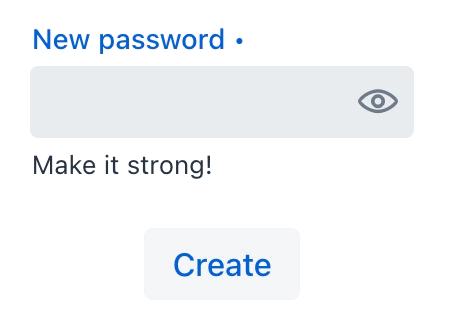
The following example demonstrates basic passwordField functionality:
<passwordField id="passwordField"
               label="New password"
               required="true"
               clearButtonVisible="true"
               helperText="Make it strong!">
</passwordField>
<button id="createPasswordButton"
        text="Create"/>
@ViewComponent
protected JmixPasswordField passwordField;
@Autowired
protected Notifications notifications;
@Subscribe("createPasswordButton")
protected void onButtonClick(ClickEvent<Button> event) {
if (!passwordField.getValue().isEmpty())
notifications.create("Password created")
.show();
}
The set of attributes for the passwordField component is similar to the attributes available for the textField component. However, there is no datatype attribute – the input for a passwordField can only be of type String.
Attributes
id - alignSelf - allowedCharPattern - ariaLabel - ariaLabelledBy autocapitalize - autocomplete - autocorrect - autofocus - autoselect - classNames - css - clearButtonVisible - colspan - dataContainer - enabled - errorMessage - focusShortcut - height - helperText - label - maxHeight - maxWidth - minHeight - minWidth - pattern - placeholder - property - readOnly - required - requiredMessage - tabIndex - themeNames - title - value - valueChangeMode - valueChangeTimeout - visible - width
Handlers
AttachEvent - BlurEvent - ComponentValueChangeEvent - CompositionEndEvent - CompositionStartEvent - CompositionUpdateEvent - DetachEvent - FocusEvent - InputEvent - KeyDownEvent - KeyPressEvent - KeyUpEvent - validator - statusChangeHandler
|
Чтобы сгенерировать заглушку обработчика в Jmix Studio, используйте вкладку Handlers панели инспектора Jmix UI, или команду Generate Handler, доступную на верхней панели контроллера экрана и через меню Code → Generate (Alt+Insert / Cmd+N). |
validator
Adds a validator instance to the component. The validator must throw ValidationException if the value is not valid.
@Install(to = "passwordField", subject = "validator")
private void passwordFieldValidator(String value) {
    if (value != null && value.length() < 8)
        throw new ValidationException("Password must be at least 8 characters long");
}
Elements


See Also
See Vaadin Docs for more information.