tabs
Basics
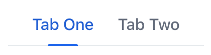
By default, tabs are displayed in a horizontal row, with the tab labels arranged one after another. This row of tabs is typically positioned at the top or bottom of the associated content area.
The following example demonstrates basic tabs functionality.
XML code
<tabs id="tabs">
    <tab id="tab1" label="Tab One"/>
    <tab id="tab2" label="Tab Two"/>
</tabs>
In this example, the component contains two nested tab elements. To update the content associated with the selected tab, define an event handler that listens for the SelectedChangeEvent. When a tab is selected, this event is fired, allowing you to update the displayed content accordingly.
Orientation
While horizontal orientation is default, vertical orientation can be alternative option in certain scenarios. For example, with a larger number of tabs, this orientation may provide additional space for their labels.
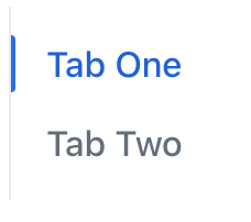
Use the orientation attribute to change the orientation of tabs.
States
A tab can be selected, unselected, or disabled:
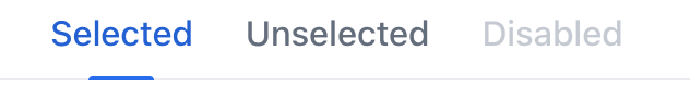
These states allow users to easily determine which tab is currently active and which tabs may be temporarily unavailable or disabled.
Labels
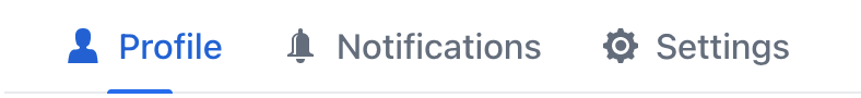
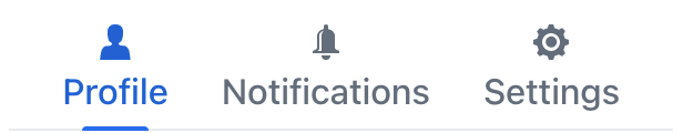
Individual tabs can nest almost any components within them. This allows to compose visually distinctive tab labels:
XML code
<tabs>
    <tab id="profileTab">
        <icon icon="USER"/>
        <span text="Profile"/>
    </tab>
    <tab id="notificationsTab">
        <icon icon="BELL"/>
        <span text="Notifications"/>
    </tab>
    <tab id="settingsTab">
        <icon icon="COG"/>
        <span text="Settings"/>
    </tab>
</tabs>
Theme Variants
The component’s appearance is customizable with the themeNames attribute. Choose from the following themes and combine them together as needed:
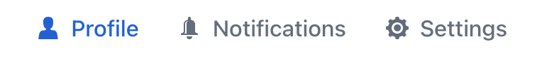
icon-on-top
When a tab label includes an icon, positions it above the text label instead of displaying them side-by-side:
Each tab element must have this theme applied to it individually.
Show XML
<tabs>
<tab id="profileTab" themeNames="icon-on-top">
<icon icon="USER"/>
<span text="Profile"/>
</tab>
<tab id="notificationsTab" themeNames="icon-on-top">
<icon icon="BELL"/>
<span text="Notifications"/>
</tab>
<tab id="settingsTab" themeNames="icon-on-top">
<icon icon="COG"/>
<span text="Settings"/>
</tab>
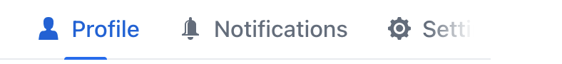
</tabs>centered
Positions the tabs at the center of the container or view, instead of their default left-aligned position:


Attributes
id - alignSelf - classNames - colspan - css - height - maxHeight - maxWidth - minHeight - minWidth - orientation - themeNames - visible - width
Handlers
|
Чтобы сгенерировать заглушку обработчика в Jmix Studio, используйте вкладку Handlers панели инспектора Jmix UI, или команду Generate Handler, доступную на верхней панели контроллера экрана и через меню Code → Generate (Alt+Insert / Cmd+N). |
SelectedChangeEvent
com.vaadin.flow.component.tabs.Tabs.SelectedChangeEvent is fired when another tab is selected.
The following example adds a label when a tab is selected:
@ViewComponent
private VerticalLayout content;

@Subscribe("tabs")
public void onTabsSelectedChange(final Tabs.SelectedChangeEvent event) {
    setTabContent(event.getSelectedTab());
}
private void setTabContent(Tab tab) {
    content.removeAll();
    Div tabLabel = uiComponents.create(Div.class);
    if ("tab1".equals(tab.getId().orElse(null))) {
        tabLabel.setText("Tab One is selected");
        content.add(tabLabel);
    } else {
        tabLabel.setText("Tab Two is selected");
        content.add(tabLabel);
    }
}
Elements
|
To add an element in Jmix Studio, select the component in the view descriptor XML or in the Jmix UI structure panel and click on the Add button in the Component Inspector panel. |
tab
Individual tabs are defined with nested tab elements.
tab attributes
id - ariaLabel - ariaLabelledBy - classNames - colspan - css - enabled - flexGrow - label - themeNames - visible
tab handlers
See Also
See the Vaadin Docs for more information.