select
select позволяет пользователям выбрать одно значение из списка элементов, представленного в оверлее.
XML-элемент |
|
|---|---|
Java-класс |
|
Атрибуты |
id - alignSelf - ariaLabel - ariaLabelledBy - autofocus - classNames - colspan - css - dataContainer - datatype - emptySelectionAllowed - emptySelectionCaption - enabled - errorMessage - focusShortcut - height - helperText - itemsContainer - itemsEnum - label - maxHeight - maxWidth - minHeight - minWidth - noVerticalOverlap - overlayClass - overlayWidth - placeholder - property - readOnly - required - requiredMessage - tabIndex - themeNames - visible - width |
Обработчики |
AttachEvent - BlurEvent - ClientValidatedEvent - ComponentValueChangeEvent - DetachEvent - FocusEvent - InvalidChangeEvent - OpenedChangeEvent - itemEnabledProvider - itemLabelGenerator - renderer - statusChangeHandler - textRenderer - validator |
Элементы |
Основы
select похож на comboBox.
Используйте select, когда:
-
Вам не нужны пользовательский ввод и фильтрация элементов.
-
Список должен быть компактным. Это может быть полезно, если список элементов слишком длинный для radioButtonGroup.
Простейший случай использования select - это выбор значения из перечисления:
<select itemsEnum="com.company.onboarding.entity.DayOfWeek"
        label="Select the day of week"/>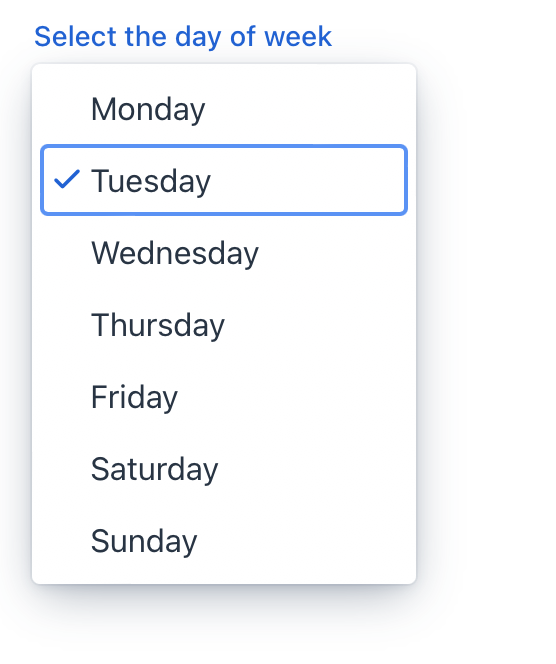
Привязка данных
Привязка данных означает связывание визуального компонента с контейнером данных. Изменения в визуальном компоненте или соответствующем контейнере данных могут вызывать обновления друг друга. Смотрите Использование компонентов данных для получения дополнительной информации.
По умолчанию Jmix Studio генерирует select при создании экрана деталей сущности с атрибутом типа перечисления. Например, сущность User имеет атрибут onboardingStatus типа OnboardingStatus, который является перечислением.
<data>
    <instance id="userDc"
              class="com.company.onboarding.entity.User">
        <fetchPlan extends="_base"/>
        <loader id="userDl"/>
    </instance>
</data>
<layout>
    <formLayout id="form" dataContainer="userDc">
        <select id="onboardingStatusField"
                property="onboardingStatus"/>
    </formLayout>
</layout>
В следующем примере показано, как использовать компонент select для выбора отдела, к которому принадлежит пользователь:
<data>
    <instance class="com.company.onboarding.entity.User"
              id="userDc"> (1)
        <fetchPlan extends="_base"> (2)
            <property name="department" fetchPlan="_base"/>
        </fetchPlan>
        <loader id="userDl"/>
    </instance>
    <collection class="com.company.onboarding.entity.Department"
                id="departmentsDc"> (3)
        <fetchPlan extends="_base"/>
        <loader id="departmentsDl">
            <query>
                <![CDATA[select e from Department e]]>
            </query>
        </loader>
    </collection>
</data>
<facets>
    <dataLoadCoordinator auto="true"/> (4)
</facets>
<layout>
    <select dataContainer="userDc"
            property="department"
            itemsContainer="departmentsDc"/> (5)
</layout>| 1 | Контейнер данных для хранения экземпляра User, который в данный момент редактируется. |
| 2 | План выборки расширен для получения коллекции экземпляров Department, которые будут доступны для выбора. |
| 3 | Контейнер данных для хранения коллекции всех существующих экземпляров Department. |
| 4 | Координатор загрузки данных для автоматического предоставления компоненту экземпляров для выбора. |
| 5 | Привязка компонента к контейнеру данных и свойству. Указание коллекции экземпляров для выбора с использованием атрибута itemsContainer. |
Формирование списка опций
Для установки списка элементов select используйте следующие методы:
Список элементов
<select id="selectItems" datatype="int"/>Метод setItems() позволяет вам программно задать элементы компонента.
@ViewComponent
private JmixSelect<Integer> selectItems;

@Subscribe
public void onInit(final InitEvent event) {
    selectItems.setItems(1, 2, 3, 4, 5);
}
Список элементов с описаниями
<select id="selectMaps" datatype="int"/>ComponentUtils.setItemsMap() позволяет вам явно указать строковое описание для каждого значения элемента.
@ViewComponent
private JmixSelect<Integer> selectMaps;

@Subscribe
public void onInit(final InitEvent event) {
    Map<Integer, String> map = new LinkedHashMap<>();
    map.put(2, "Poor");
    map.put(3, "Average");
    map.put(4, "Good");
    map.put(5, "Excellent");
    ComponentUtils.setItemsMap(selectMaps, map);
}
Список значений перечисления
Вы можете использовать либо декларативный, либо программный подход для установки значений перечисления в качестве элементов select.
В следующем примере показан декларативный подход.
<select id="selectEnum"
        itemsEnum="com.company.onboarding.entity.DayOfWeek"/>
Пример ниже использует программный подход.
@ViewComponent
private JmixSelect<DayOfWeek> selectEnum;

@Subscribe
public void onInit(final InitEvent event) {
    selectEnum.setItems(DayOfWeek.class);
}
Неактивные элементы списка
Элементы списка могут быть отключены, чтобы указать, что они недоступны для выбора, но могут быть выбраны при других условиях.
itemEnabledProvider позволяет динамически управлять состоянием включения отдельных элементов в зависимости от определенных условий. Отключенные элементы отображаются серым цветом и не могут быть выбраны пользователем. По умолчанию все элементы включены.
@Install(to = "select", subject = "itemEnabledProvider")
private boolean selectItemEnabledProvider(final Department department) {
    return department == null || department.getHrManager() != null;
}
Элемент пустого выбора
Компонент select предоставляет возможность отображать элемент пустого выбора, что полезно в случаях, где требуется значение по умолчанию или состояние "отсутствия выбора".
Атрибут emptySelectionAllowed устанавливает, разрешено ли пользователю ничего не выбирать. При установке значения true пользователю показывается специальный пустой элемент.
Элемент пустого выбора можно настроить с помощью атрибута emptySelectionCaption.
<select id="sizeSelect"
        emptySelectionAllowed="true"
        emptySelectionCaption="Unknown size"
        datatype="string"/>
Атрибут emptySelectionCaption задаёт подпись для пустого выбора, когда emptySelectionAllowed = true. Эта подпись отображается для элемента пустого выбора в выпадающем списке.
Когда выбран элемент пустого выбора, select отображает значение, предоставленное itemLabelGenerator для нулевого элемента, или строку, установленную атрибутом placeholder, или пустую строку, если placeholder не установлен.
@Install(to = "sizeSelect", subject = "itemLabelGenerator")
private String sizeSelectItemLabelGenerator(final String t) {
    return t != null ? t : sizeSelect.getEmptySelectionCaption();
}
Настройка отображения элементов
itemLabelGenerator позволяет вам настроить способ отображения элементов в выпадающем списке. Это даёт вам контроль над текстом, который видят пользователи, позволяя вам представлять информацию более удобным для пользователя или контекстно-зависимым способом.
@Install(to = "customItemsSelect", subject = "itemLabelGenerator")
private String customItemsSelectItemLabelGenerator(final Department t) {
    return t.getHrManager() != null
            ? t.getName() + "[Manager: " + t.getHrManager().getFirstName() +
            " " + t.getHrManager().getLastName() + "]"
            : t.getName();
}
itemLabelGenerator управляет как метками для каждого элемента в выпадающем списке, так и текстом, отображаемым в поле ввода компонента select, когда выбран элемент.
textRenderer управляет метками, отображаемыми в выпадающем списке для каждого элемента.
@Install(to = "departmentSelect", subject = "textRenderer")
private String departmentSelectTextRenderer(final Department t) {
    return t.getName() + ", number #" + t.getNum();
}
textRenderer не влияет на текст, отображаемый в поле ввода компонента select после выбора элемента.
|
Используйте, когда вы хотите настроить метки, отображаемые в выпадающем списке. Это полезно для повышения ясности, добавления дополнительной информации или адаптации меток на основе свойств выбранного объекта.
Рендеринг элементов
Можно настроить рендеринг элементов. Рендерер применяется к каждому элементу для создания компонента, который представляет этот элемент.
Для этого можно использовать метод setRenderer() или аннотацию @Supply.
@Autowired
private UiComponents uiComponents;

@Supply(to = "selectWithRenderer", subject = "renderer") (1)
private ComponentRenderer<Button, Department> selectWithRendererRenderer() {
    return new ComponentRenderer<>(item -> { (2)
        Button button = uiComponents.create(Button.class); (3)
        button.setText(item.getName());
        button.setIcon(VaadinIcon.DESKTOP.create());
        return button; (4)
    });
}| 1 | @Supply привязывает рендерер к selectWithRenderer. |
| 2 | Функция получает текущий элемент. |
| 3 | Экземпляр компонента создается и настраивается в этом же обработчике. |
| 4 | Функция возвращает компонент для текущего элемента. |
В качестве альтернативы вы можете отображать элементы, используя вложенный элемент fragmentRenderer. Дополнительную информацию смотрите в разделе Рендерер фрагментов.
Оверлей
Оверлей - это полупрозрачный или непрозрачный слой, который используется для создания выпадающего списка элементов.
Атрибут overlayClass позволяет вам добавлять пользовательские CSS-классы к элементу оверлея.
<select itemsEnum="com.company.onboarding.entity.DayOfWeek"
        overlayClass="my-custom-overlay"/>
Определите свой собственный стиль в вашем CSS-файле:
vaadin-select-overlay.my-custom-overlay::part(overlay){
    background-color: #ecfcf9;
    border-radius: 5px;
}
Варианты темы
Используйте атрибут themeNames для настройки темы компонента.
| Вариант | Описание | Поддерживается в |
|---|---|---|
|
Выравнивает значение поля по левому краю. |
Aura, Lumo |
|
Выравнивает значение поля по центру. |
Aura, Lumo |
|
Выравнивает значение поля по правому краю. |
Aura, Lumo |
|
Выравнивает значение поля по начальной стороне с учетом текущего направления текста. |
Aura |
|
Выравнивает значение поля по конечной стороне с учетом текущего направления текста. |
Aura |
|
Размещает вспомогательный текст над полем, под меткой. |
Aura, Lumo |
|
Уменьшает размер компонента. |
Aura, Lumo |
Атрибуты
В Jmix есть множество общих атрибутов, которые выполняют одну и ту же функцию для всех компонентов.
Ниже приведены атрибуты, специфичные для select:
Название |
Описание |
Значение по умолчанию |
|---|---|---|
Устанавливает, разрешено ли пользователю ничего не выбирать в списке. Смотрите Элемент пустого выбора. |
|
|
Задаёт подпись для пустого элемента, когда |
Пустая строка "" |
|
Определяет контейнер данных, содержащий список элементов. Компонент отображает имя экземпляра сущности. Смотрите второй пример в разделе Привязка данных. |
||
Определяет класс перечисления для создания списка элементов. Смотрите Список значений перечисления. |
||
Когда |
|
|
Определяет список имён CSS-классов, разделённых пробелами, для установки на элементе оверлея. Смотрите Оверлей. |
||
Задаёт ширину оверлея. Если параметр не указан (значение по умолчанию), ширина оверлея автоматически подбирается так, чтобы соответствовать самой широкой опции или, как минимум, ширине поля ввода. См. документацию Vaadin. |
Обработчики
В Jmix существует множество общих обработчиков, которые конфигурируются одинаково для всех компонентов.
Ниже приведены обработчики, специфичные для select.
|
Чтобы сгенерировать заглушку обработчика в Jmix Studio, используйте вкладку Handlers панели инспектора Jmix UI, или команду Generate Handler, доступную на верхней панели контроллера экрана и через меню Code → Generate (Alt+Insert / Cmd+N). |
Название |
Описание |
|---|---|
|
|
|
|
|
|
Позволяет вам настроить метки, отображаемые для каждого элемента. Смотрите Настройка отображения элементов. |
|
Устанавливает рендерер для этой группы элементов |
|
Это рендерер для преобразования элемента в строку. Смотрите Настройка отображения элементов. |
Смотрите также
Дополнительную информацию смотрите в документации Vaadin.