dropdownButton
dropdownButton представляет собой основную кнопку, которая при нажатии раскрывает выпадающее меню, содержащее список элементов.
XML-элемент |
|
|---|---|
Java-класс |
|
Атрибуты |
id - alignSelf - classNames - colspan - css - dropdownIndicatorVisible - enabled - focusShortcut - height - icon - maxHeight - maxWidth - minHeight - minWidth - openOnHover - overlayClass - tabIndex - text - themeNames - title - visible - whiteSpace - width |
Обработчики |
|
Элементы |
Основы
На основной кнопке отображается текст или иконка (или и то, и другое), представляющие компонент. Пользователи нажимают эту кнопку, чтобы получить доступ к выпадающему меню.
Выпадающее меню содержит список действий, каждое из которых представлено кликабельным элементом.
Каждый элемент в выпадающем меню может представлять действие. Когда пользователь нажимает на действие, срабатывает соответствующий обработчик события.
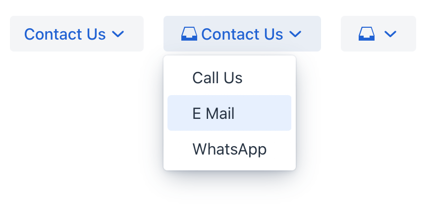
Вот пример определения кнопки dropdownButton c текстом, иконкой и всплывающей подсказкой (используя атрибут title), извлекаемых из пакета сообщений:
<dropdownButton icon="MAILBOX" text="Contact Us" title="msg://contact">
    <items>
        <textItem id="callItem" text="Call Us"/>
        <textItem id="emailItem" text="E Mail"/>
        <textItem id="whatsAppItem" text="WhatsApp"/>
    </items>
</dropdownButton>
Элементы
Кнопка dropdownButton, определенная в XML-дескрипторе, может содержать вложенные элементы:
actionItem
Элемент actionItem создает связь между элементом выпадающего меню и конкретным действием, которое должно быть выполнено при нажатии на этот элемент.
Используйте атрибут ref, чтобы указать на идентификатор определенного действия.
<actions>
    <action id="callAction" text="Call Us" icon="PHONE"/>
</actions>
<layout>
    <dropdownButton icon="MAILBOX" title="msg://contact" id="callBtn">
        <items>
            <actionItem id="callUsItem" ref="callAction"/>
        </items>
    </dropdownButton>
</layout>
Когда пользователь нажимает на actionItem в выпадающем меню, Jmix автоматически запускает действие, на которое ссылается атрибут ref. Сгенерируйте метод обработчика события ActionPerformedEvent для этого действия. Добавьте в него логику:
@Subscribe("callAction")
public void onCallAction(final ActionPerformedEvent event) {
    notifications.show("Phone number: +6(876)5463");
}
componentItem
Элемент componentItem позволяет вам определять собственное внутреннее содержимое для кнопки dropdownButton.
<layout>
    <dropdownButton icon="MAILBOX" title="msg://contact" id="callBtn">
        <items>
            <componentItem id="emailIt">
                <hbox padding="false">
                    <icon icon="MAILBOX"/>
                    <span text="E Mail"/>
                </hbox>
            </componentItem>
        </items>
    </dropdownButton>
</layout>
Вы можете сгенерировать заглушку обработчика события DropdownButtonItem.ClickEvent для componentItem с помощью Jmix Studio.
@Subscribe("callBtn.emailIt")
public void onEmailItClick(final DropdownButtonItem.ClickEvent event) {
    notifications.show("Email: test@river.net");
}
textItem
Элемент textItem содержит текст.
<layout>
    <dropdownButton icon="MAILBOX" title="msg://contact" id="callBtn">
        <items>
            <textItem id="whatsAppIt" text="WhatsApp"/>
        </items>
    </dropdownButton>
</layout>
Вы можете сгенерировать заглушку обработчика события DropdownButtonItem.ClickEvent для textItem с помощью Jmix Studio.
@Subscribe("callBtn.whatsAppIt")
public void onCallBtnWhatsAppItClick(final DropdownButtonItem.ClickEvent event) {
    notifications.show("`WhatsApp: +6(876)5463");
}icon
The icon element adds a custom icon.
Варианты темы
Используйте атрибут themeNames для настройки темы компонента.
| Вариант | Описание | Поддерживается в |
|---|---|---|
|
Применяет основной стиль кнопки. |
Aura, Lumo |
|
Применяет стиль успеха. |
Aura, Lumo |
|
Применяет стиль предупреждения. |
Aura, Lumo |
|
Применяет стиль ошибки. |
Aura, Lumo |
|
Применяет контрастный стиль. |
Lumo |
|
Увеличивает размер кнопки. |
Aura, Lumo |
|
Уменьшает размер кнопки. |
Aura, Lumo |
|
Применяет стиль кнопки-значка. |
Aura, Lumo |
|
Применяет стиль кнопки с меньшим визуальным акцентом. |
Aura, Lumo |
|
Применяет встроенный стиль кнопки для использования внутри текстового содержимого. |
Lumo |
Атрибуты
В Jmix есть множество общих атрибутов, которые выполняют одну и ту же функцию для всех компонентов.
Ниже приведены атрибуты, специфичные для dropdownButton:
Название |
Описание |
Значение по умолчанию |
|---|---|---|
Устанавливает видимость индикатора раскрытия списка. |
|
|
Если атрибут |
|