textField
textField is a component for editing or displaying small pieces of text.
-
XML element:
textField -
Java class:
TypedTextField
Basics
textField is a typed component. You can set the data type using the datatype attribute. It is used to format field values.
Usage example:
<textField id="nameField"
           label="Name"
           datatype="string"
           clearButtonVisible="true"
           helperText="msg://textField.helper"/>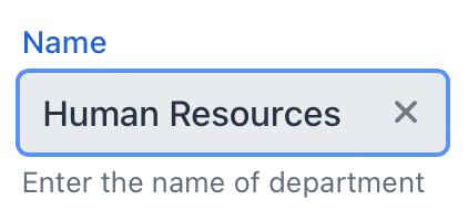
To work immediately with the necessary type (Integer, Long, etc.), TypedTextField has methods:
-
setTypedValue() -
getTypedValue()
To create textField connected to data, use dataContainer and property attributes.
<data>
    <instance class="com.company.onboarding.entity.Department"
              id="departmentDc">
        <fetchPlan extends="_base"/>
        <loader id="departmentDl"/>
    </instance>
</data>
<layout>
    <textField dataContainer="departmentDc"
               property="name"/>
</layout>
In the example above, the view describes the departmentDc data container for the Department entity, which has the name attribute. The textField component has a link to the container specified in the dataContainer attribute; the property attribute contains the name of the entity attribute that is displayed in textField.
Attributes
id - alignSelf - allowedCharPattern - autocapitalize - autocomplete - autocorrect - autofocus - autoselect - classNames - clearButtonVisible - dataContainer - datatype - enabled - errorMessage - height - helperText - invalid - label - maxHeight - maxWidth - minHeight - minWidth - pattern - placeholder - property - readOnly - required - requiredIndicatorVisible - requiredMessage - themeNames - title - value - valueChangeMode - valueChangeTimeout - visible - width
autoselect
Set to true to always have the field value automatically selected when the field gains focus, false otherwise.
value
Defines the value of textField.
If the value cannot be parsed to a required data type, the default conversion error message appears.
Handlers
AttachEvent - BlurEvent - ChangeEvent - ComponentValueChangeEvent - CompositionEndEvent - CompositionStartEvent - CompositionUpdateEvent - DetachEvent - FocusEvent - InputEvent - InvalidChangeEvent - KeyDownEvent - KeyPressEvent - KeyUpEvent - statusChangeHandler - TypedValueChangeEvent - validator
|
Чтобы сгенерировать заглушку обработчика в Jmix Studio, используйте вкладку Handlers панели инспектора Jmix UI, или команду Generate Handler, доступную на верхней панели контроллера экрана и через меню Code → Generate (Alt+Insert / Cmd+N). |
ChangeEvent
com.vaadin.flow.component.textfield.GeneratedVaadinTextField.ChangeEvent corresponds to the change DOM event.
InvalidChangeEvent
com.vaadin.flow.component.textfield.GeneratedVaadinTextField.InvalidChangeEvent is sent when the value of the invalid attribute of the component changes.
validator
Adds a validator instance to the component. The validator must throw ValidationException if the value is not valid.
@Install(to = "zipField", subject = "validator")
protected void zipFieldValidator(Integer value) {
    if (value != null && String.valueOf(value).length() != 6)
        throw new ValidationException("Zip must be of 6 digits length");
}See Also
See the Vaadin Docs for more information.