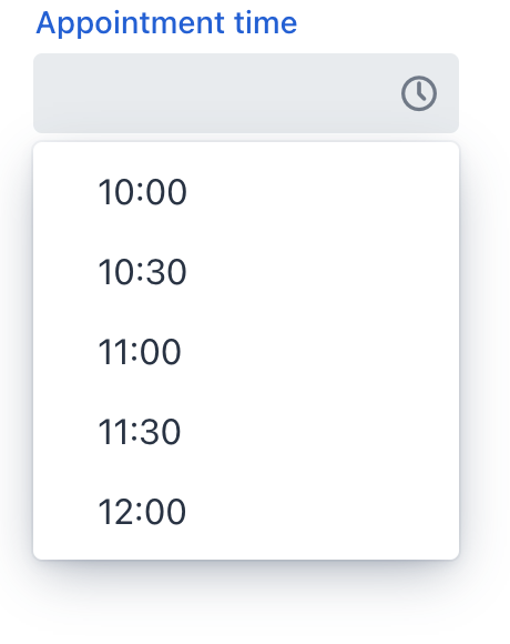
timePicker
timePicker lets users enter or select a time.
-
XML element:
timePicker -
Java class:
TypedTimePicker
Basics
Time can be entered directly using a keyboard or selected from an overlay with a list of time values. The overlay appears on clicking the field or the clock button.

The following example defines a timePicker of localTime type with a label:
<timePicker id="timePicker" datatype="localTime" label="Appointment time"/>Data Types
timePicker is a typed component which supports common data types for storing a time value:
-
localTime -
offsetTime -
time
To change the type, use the datatype attribute.
Step
The default interval between the items displayed in the overlay is set to one hour. A custom step value can be set using the step attribute. This can also be done in the view controller:
@ViewComponent
private TypedTimePicker<Comparable> timePicker;

@Subscribe
public void onInit(InitEvent event) {
    timePicker.setStep(Duration.ofMinutes(30));
}
The step must divide an hour or day evenly. For example, "15 minutes", "30 minutes" and "2 hours" are valid steps, whereas "42 minutes" isn’t.
| The overlay doesn’t appear for steps less than 15 minutes, to avoid showing an impractical number of choices. |
Time Range
To restrict the input to a specific time range, specify a minimum and maximum value using the max and min attributes. This can also be done in the view controller:
@ViewComponent
private TypedTimePicker<Comparable> timePicker;

@Subscribe
public void onInit(InitEvent event) {
    timePicker.setMin(LocalTime.of(8,0));
    timePicker.setMax(LocalTime.of(17,0));
}
Apply a validator to set a more specific time range.
Attributes
id - alignSelf - allowedCharPattern - autoOpen - classNames - clearButtonVisible - colspan - dataContainer - datatype - enabled - errorMessage - height - helperText - invalid - label - max - maxHeight - maxWidth - min - minHeight - minWidth - placeholder - property - readOnly - required - requiredIndicatorVisible - requiredMessage - step - tabIndex - visible - width
Handlers
AttachEvent - BlurEvent - ClientValidatedEvent - ComponentValueChangeEvent - DetachEvent - FocusEvent - InvalidChangeEvent - TypedValueChangeEvent - statusChangeHandler - validator
|
Чтобы сгенерировать заглушку обработчика в Jmix Studio, используйте вкладку Handlers панели инспектора Jmix UI, или команду Generate Handler, доступную на верхней панели контроллера экрана и через меню Code → Generate (Alt+Insert / Cmd+N). |
ClientValidatedEvent
ClientValidatedEvent is sent by the web component whenever it is validated on the client-side.
InvalidChangeEvent
com.vaadin.flow.component.datepicker.DatePicker.InvalidChangeEvent is sent when the value of the invalid attribute of the component changes.
validator
Adds a validator instance to the component. The validator must throw ValidationException if the value is not valid.
@Install(to = "timePicker", subject = "validator")
private void timePickerValidator(LocalTime value) {
    if (value != null && LocalTime.of(13,0).isBefore(value) && LocalTime.of(14,0).isAfter(value)) {
        throw new ValidationException("No appointments between 13:00 to 14:00.");
    }
}See Also
See Vaadin Docs for more information.