Screen Layout Rules
Below we explain how to properly place visual components and containers on your screens.
Positioning of Components
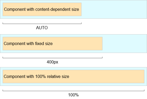
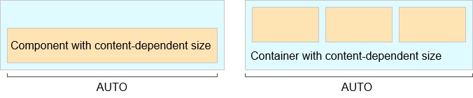
Content-dependent Size
The component will take enough space to fit its content.
Examples:
-
For Label, the size is defined by the text length.
-
For containers, the size is defined by the sum of all component sizes inside a container.
<label width="AUTO"
value="Label with content-dependent size"/>label.setWidth(Component.AUTO_SIZE);Components and containers with content-dependent size will adjust their dimensions during screen layout initialization or when the content size is changed.
Fixed Size
Fixed size implies that the component dimensions will not change at runtime.
<vbox width="320px" height="240px"/>vbox.setWidth("320px");
vbox.setHeight("240px");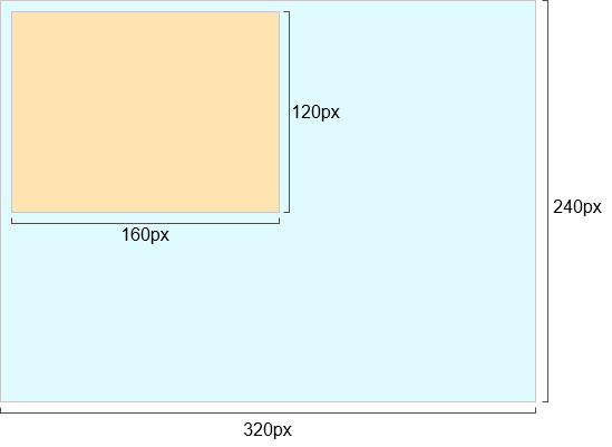
Relative Size
Relative size indicates the percentage of available space that will be occupied by the component.
<label width="100%"
value="Label with relative size"/>label.setWidth("50%");Components with relative size will react to changes in the amount of available space and adjust their actual size on the screen.
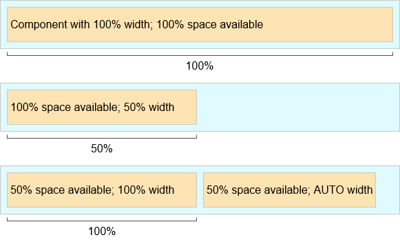
Container Specifics
By default, containers without the expand attribute provide equal space for all nested components. Exceptions: flowBox and htmlBox.
For example:
<layout>
    <button caption="Button"/>
    <button caption="Button"/>
</layout>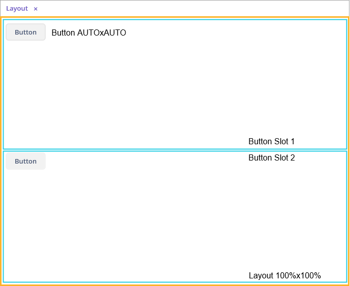
Component’s and container’s width and height are content-dependent by default. Some containers have different default dimensions:
| Container | Width | Height |
|---|---|---|
100% |
AUTO |
|
100% |
AUTO |
|
100% |
AUTO |
The root layout element is a vertical container (VBox), which has 100% width and height. The height can be AUTO in dialog mode.
Tabs within a TabSheet are VBox containers.
The GroupBox component contains a VBox or an HBox, depending on the orientation property value.
Example of a container with content-based size:
<layout>
    <vbox>
        <button caption="Button"/>
        <button caption="Button"/>
    </vbox>
</layout>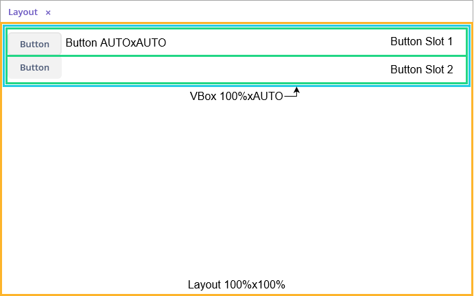
Example of a container with relative size:
<layout spacing="true">
    <groupBox caption="GroupBox"
              height="100%"/>
    <button caption="Button"/>
</layout>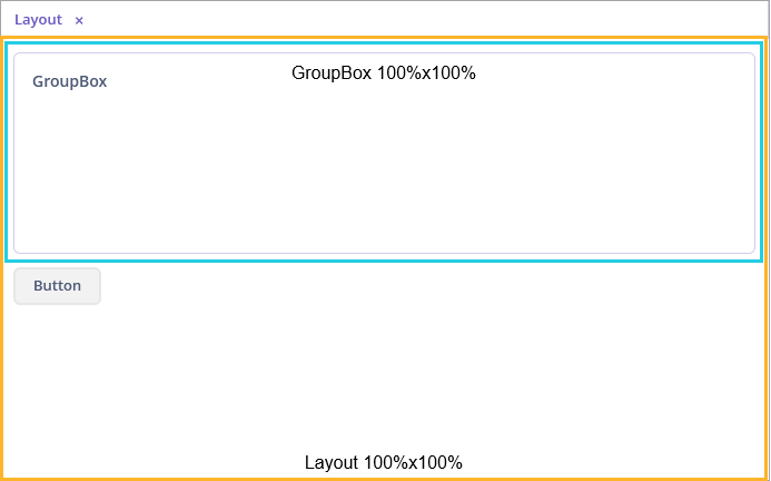
Here, layout, as well as vbox or hbox, provides equal space to all nested components, and groupBox has 100% height. In addition to that, groupBox has 100% width by default and takes all the available space.
Component Specifics
It is recommended to set the absolute or relative height for Table and Tree. Otherwise, a table/tree can take unlimited size, if there are too many rows or nodes.
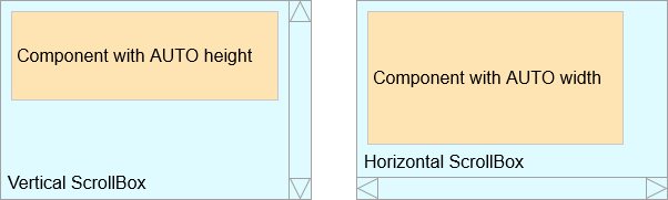
ScrollBox must have fixed or relative (but not AUTO) width and height. Components inside ScrollBox, positioned in the scrolling direction, may not have relative dimensions.
The following examples show the correct use of horizontal and vertical ScrollBox containers. If scrolling is required in both directions, both height and width must be set for the components (AUTO or absolute).
Expand Option
The container’s expand attribute allows specifying the component that will be given maximum available space.
The component specified in expand will have 100% size in the direction of the component expansion (vertically - for VBox, horizontally - for HBox). When container size is changed, the component will change its size accordingly.
<vbox expand="bigBox">
    <vbox id="bigBox"/>
    <label value="Label"/>
</vbox>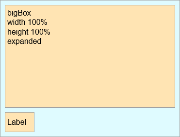
expand works relatively to component expansion, for example:
<layout spacing="true"
        expand="groupBox">
    <groupBox id="groupBox"
              caption="GroupBox"
              width="200px"/>
    <button caption="Button"/>
</layout>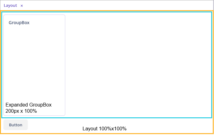
In the following example, the auxiliary Label element (spacer) is used. Due to applied expand, it takes all the space left in the container.
<layout expand="spacer">
    <textField caption="Number"/>
    <dateField caption="Date"/>
    <label id="spacer"/>
    <hbox spacing="true">
        <button caption="OK"/>
        <button caption="Cancel"/>
    </hbox>
</layout>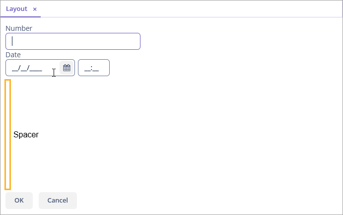
Margins and Spacing
Margin for Screen Borders
The margin attribute enables setting margins between container borders and nested components.
If margin is set to true, the margin is applied to all sides of the container.
<layout>
    <vbox margin="true" height="100%">
        <groupBox caption="Group"
                  height="100%"/>
    </vbox>
    <groupBox caption="Group"
              height="100%"/>
</layout>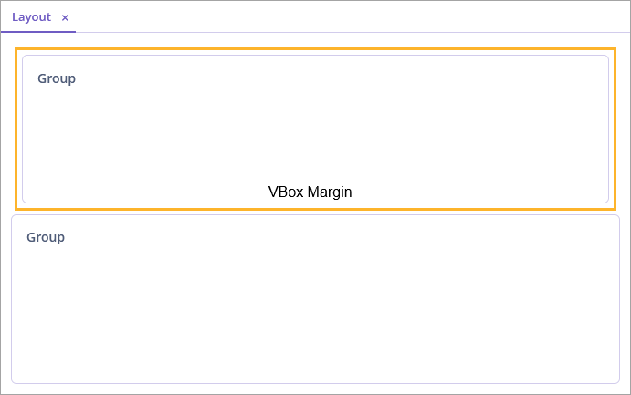
Margins can be also set for each individual side (Top, Right, Bottom, Left). An example of top and bottom margins:
<vbox margin="true,false,true,false"/>Spacing between Components
The spacing attribute indicates whether the space should be added between nested components in the direction of the container expansion.
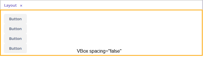
Spacing will work correctly in case some of the nested components become invisible, so you should not use margin to emulate spacing.
|
<layout spacing="true">
    <button caption="Button"/>
    <button caption="Button"/>
    <button caption="Button"/>
    <button caption="Button"/>
</layout>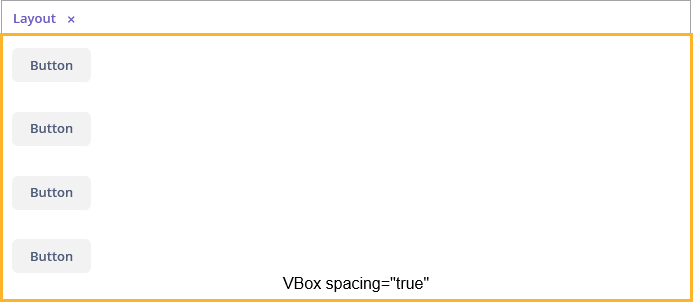
Alignment
Use the align attribute to align components within a container.
For example, here the label is located in the center of the container:
<vbox height="100%">
    <label align="MIDDLE_CENTER"
           value="Label"/>
</vbox>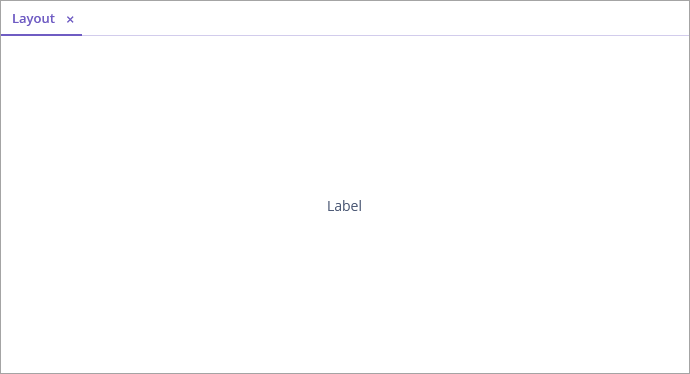
Components with specified alignment should not have 100% size in the alignment direction. The container should provide more space than required by the component. The component will be aligned within this space.
An example of alignment within available space:
<layout>
    <groupBox height="100%"
              caption="Group"/>
    <label align="MIDDLE_CENTER"
           value="Label"/>
</layout>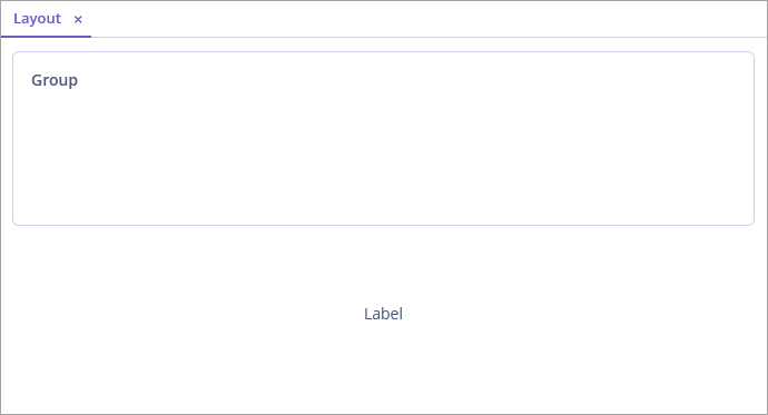
Common Layout Mistakes
- Common mistake 1. Setting relative size for a component within a container with content-based size
-
Example of incorrect layout with relative size:
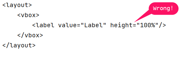
In this example, a
labelhas 100%height, while the defaultheightforVBoxisAUTO, that is, content-based.Example of incorrect layout with expand:
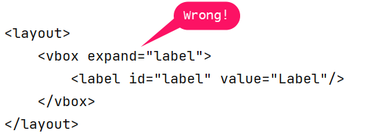
Expand implicitly sets relative
100% heightfor thelabel, which is not correct, just like in the example above. In such cases, the screen may not look as expected. Some components may disappear or have zero sizes. If you encounter any layout problems, check that relative sizes are specified correctly first of all.
- Common mistake 2. Components inside a ScrollBox have 100% dimensions
-
Example of incorrect layout:
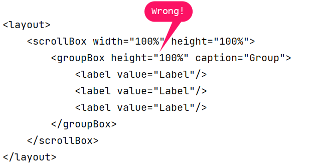
As a result of such a mistake, scroll bars in
ScrollBoxwill not appear even if the size of nested components exceeds the scrolling area.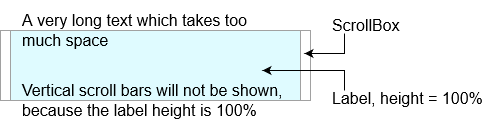
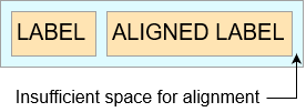
- Common mistake 3. Aligning components with insufficient space
-
Example of incorrect layout:
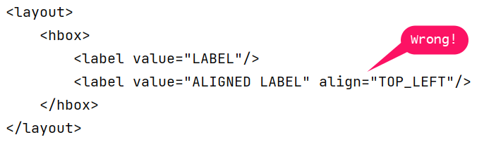
In this example,
HBoxhas content-dependent size, therefore the label alignment has no effect.